The idea.
A rock-music museum is a maze of halls, eras and artefacts: easy to wander, easy to miss the things you'd love. RockX's mobile app is the visitor's guide: scan a QR at the entrance, tell it what you're into, and it plans and leads a tour that fits you.
My role.
A three-person graduate team built RockX across three surfaces. The mobile experience was mine, end to end.
The team project
RockX as a full platform, a consumer website, the visitor mobile app, and an admin tool. Shared research and brand, with each surface owned by one designer.
What I owned
The Mobile B2C app: task modelling for the visitor, the information architecture, every flow, and the full visual design of the dark, AR-led experience.
Grounded in real tasks.
Before any screens, I modelled what visitors actually do, then prioritised by how often and how widely each task happens. Four "frequent" jobs anchored the app.
User journey map.
I mapped the full visitor journey, from arriving at the museum to leaving after the tour. Charting each stage's actions, touchpoints, and emotional highs and lows showed where the experience could guide people better. Those low points shaped the app's flows.
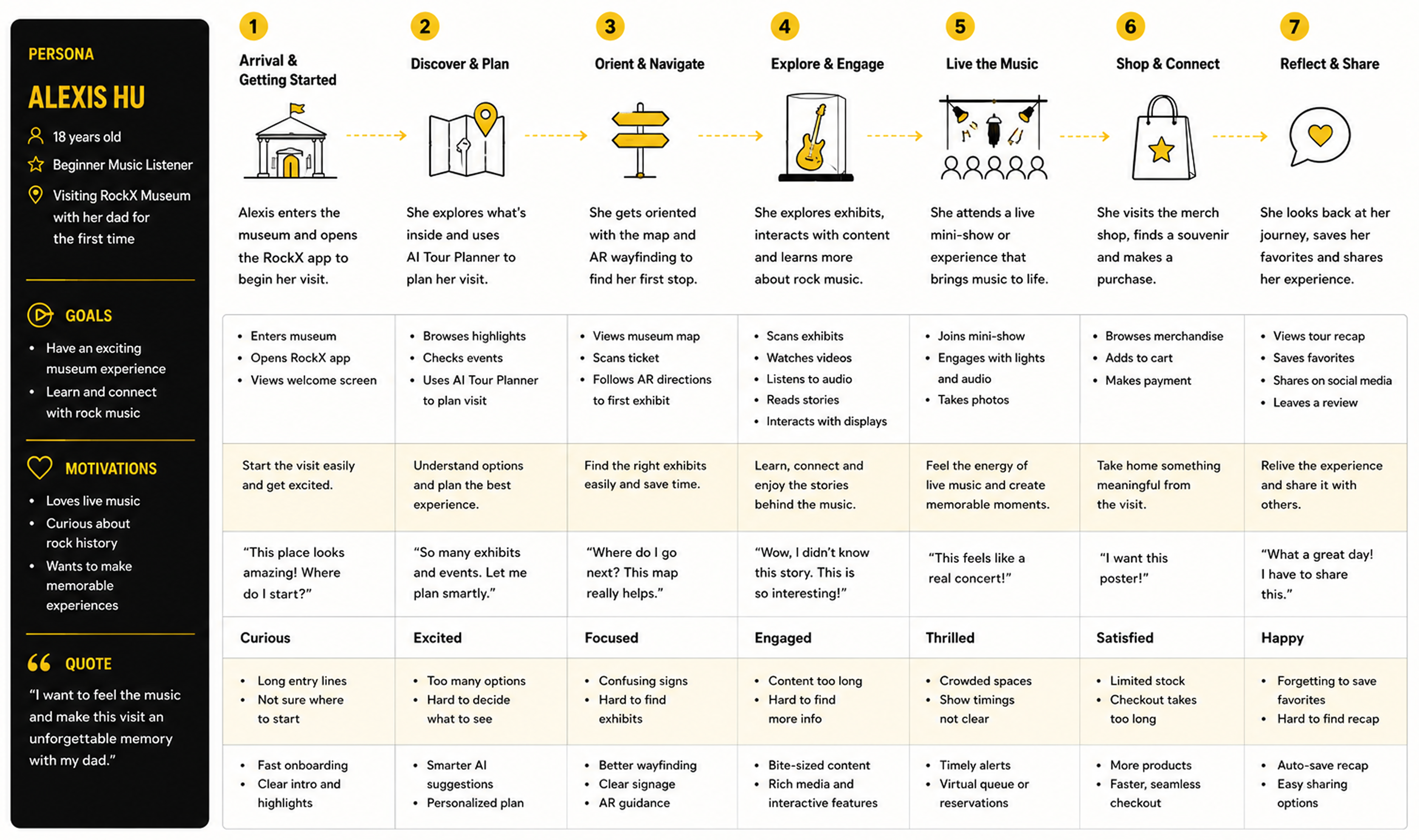
Designing RockX.
With the journey mapped, I worked out what the app had to hold and how it should be structured. I defined the core objects and actions, prioritised features by frequency and impact, and shaped it all into a clear information architecture.
1. Object-Action Matrix
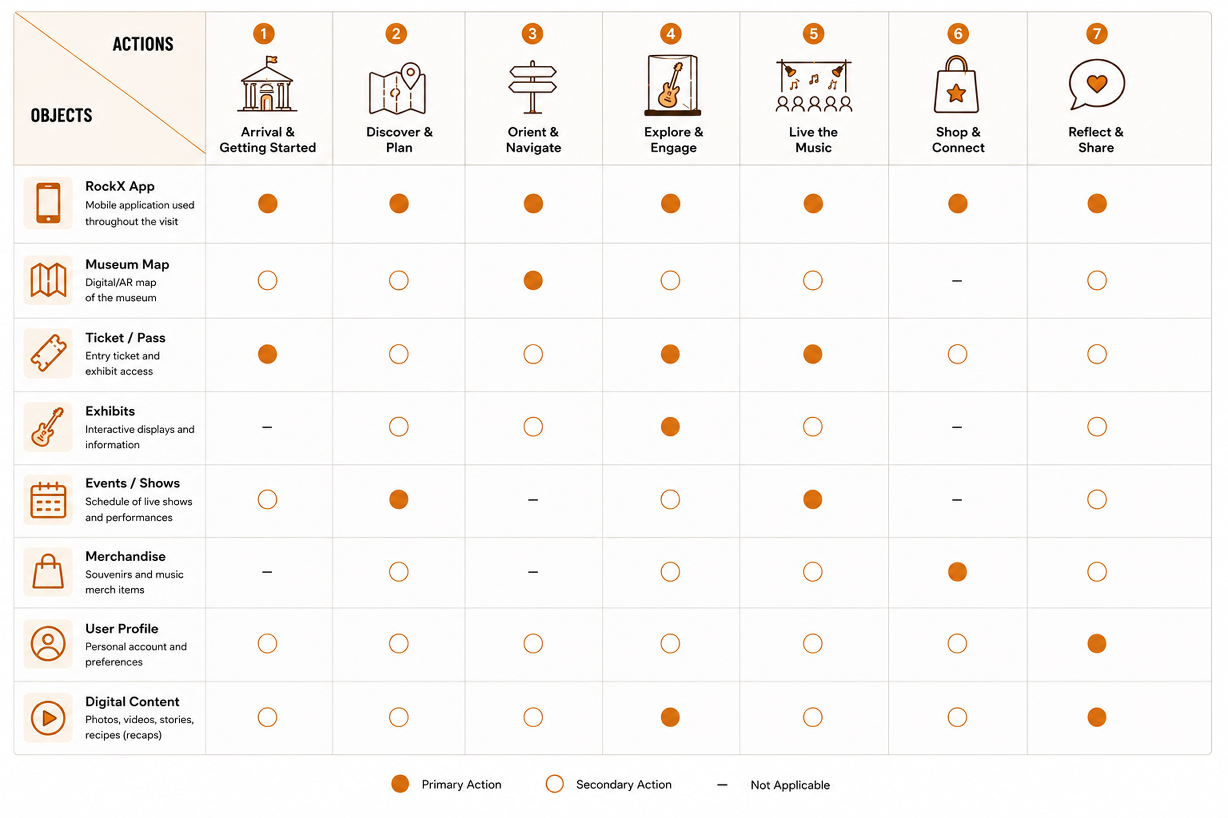
2. Prioritization Matrix
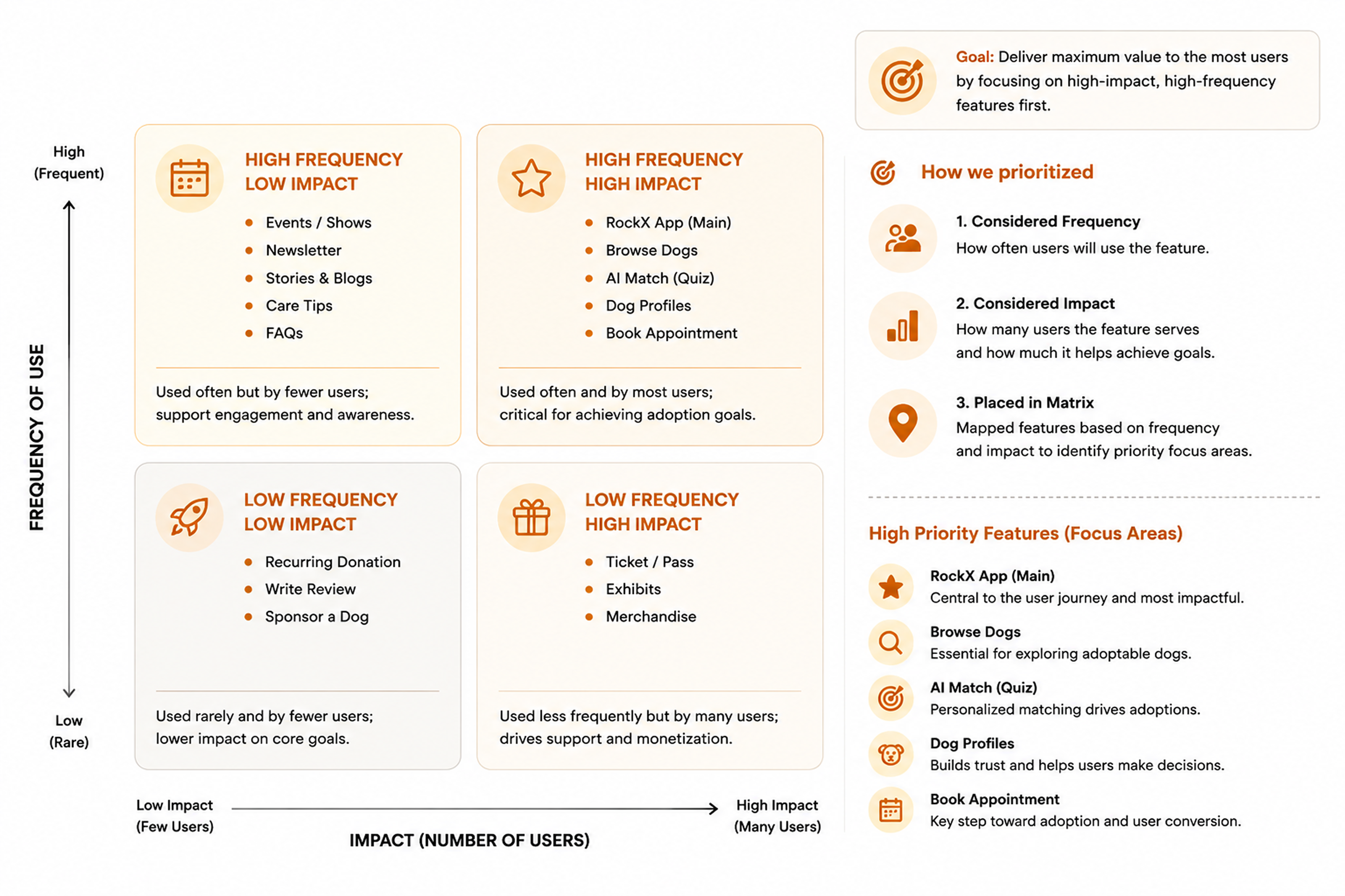
3. Information Architecture
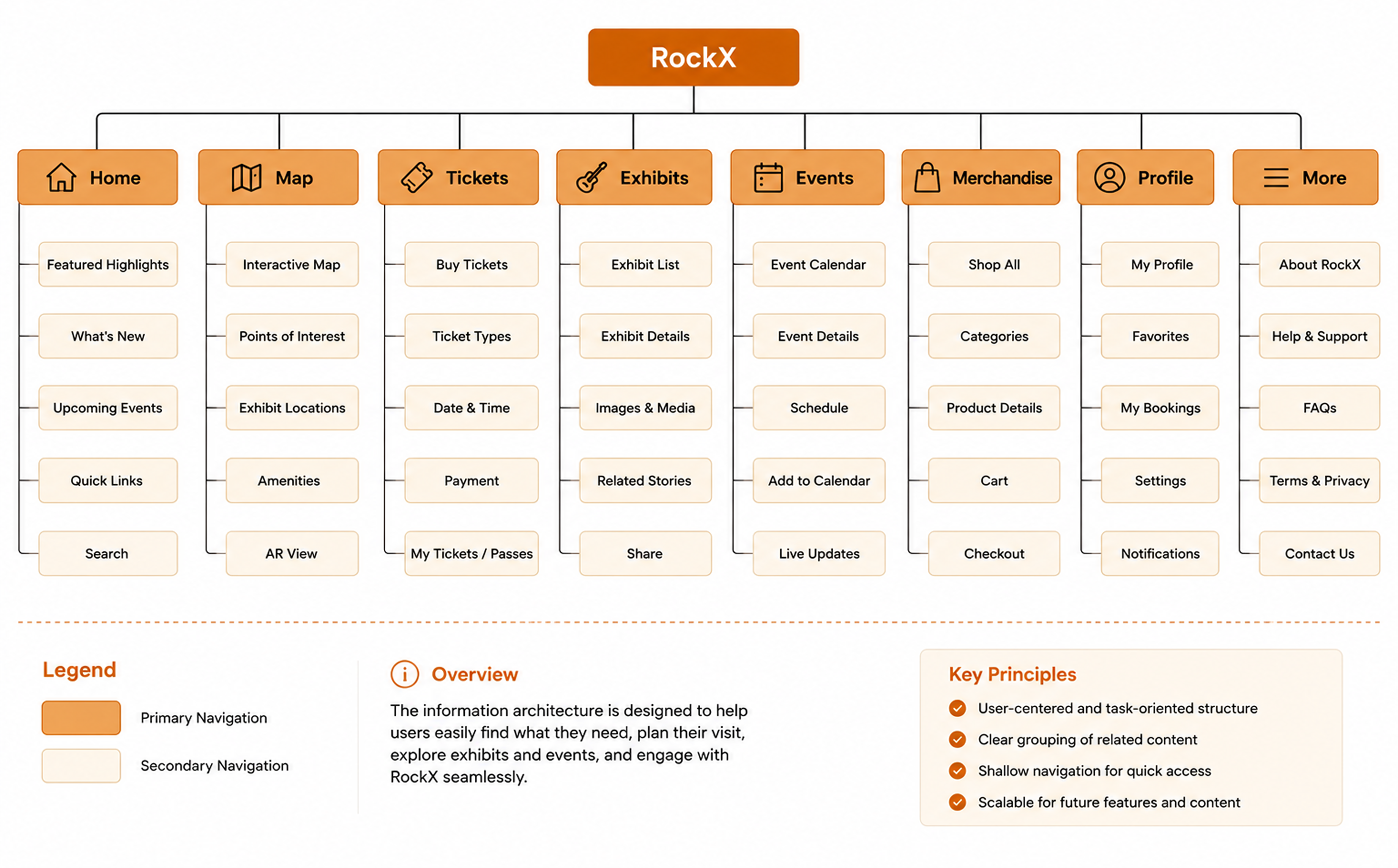
Wireframes.
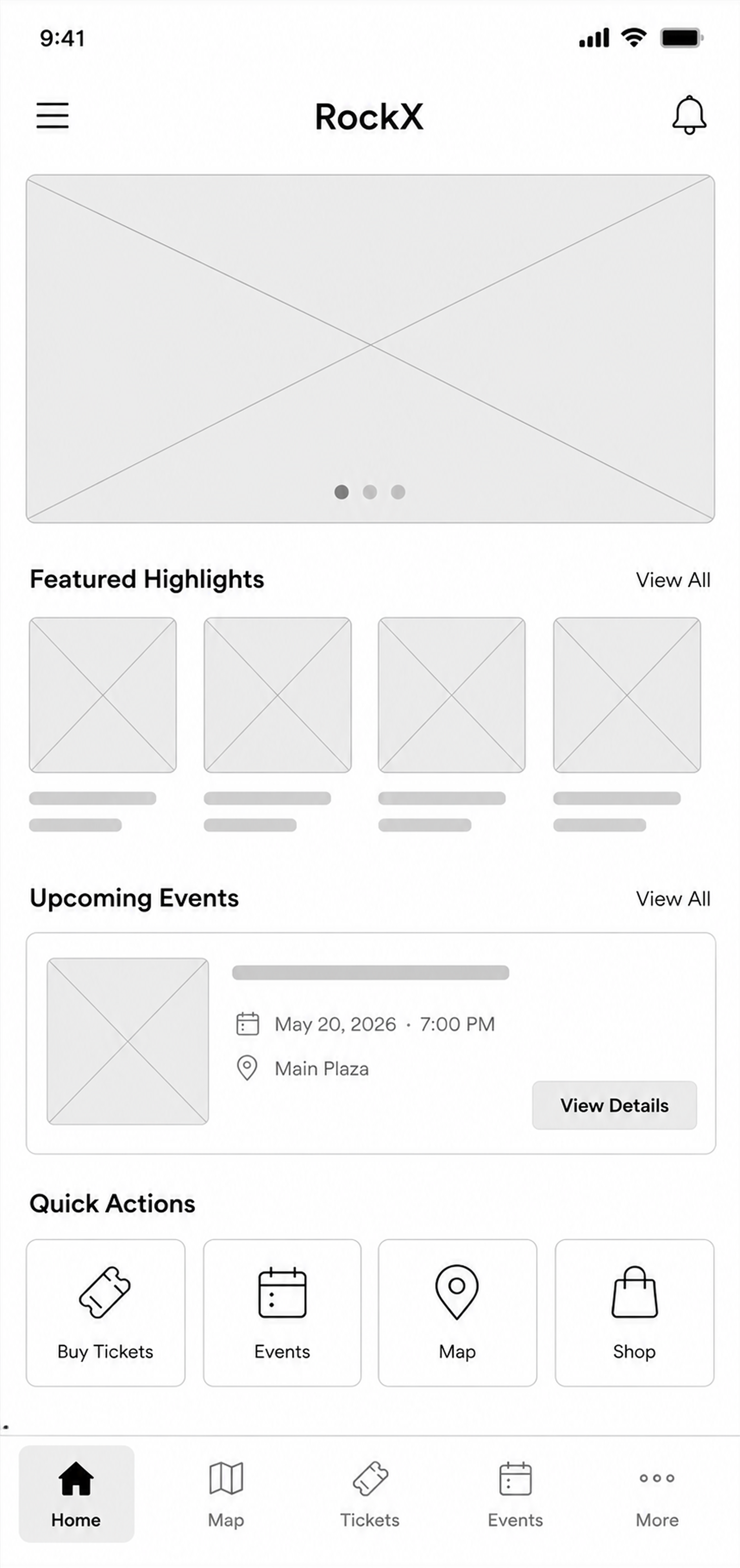
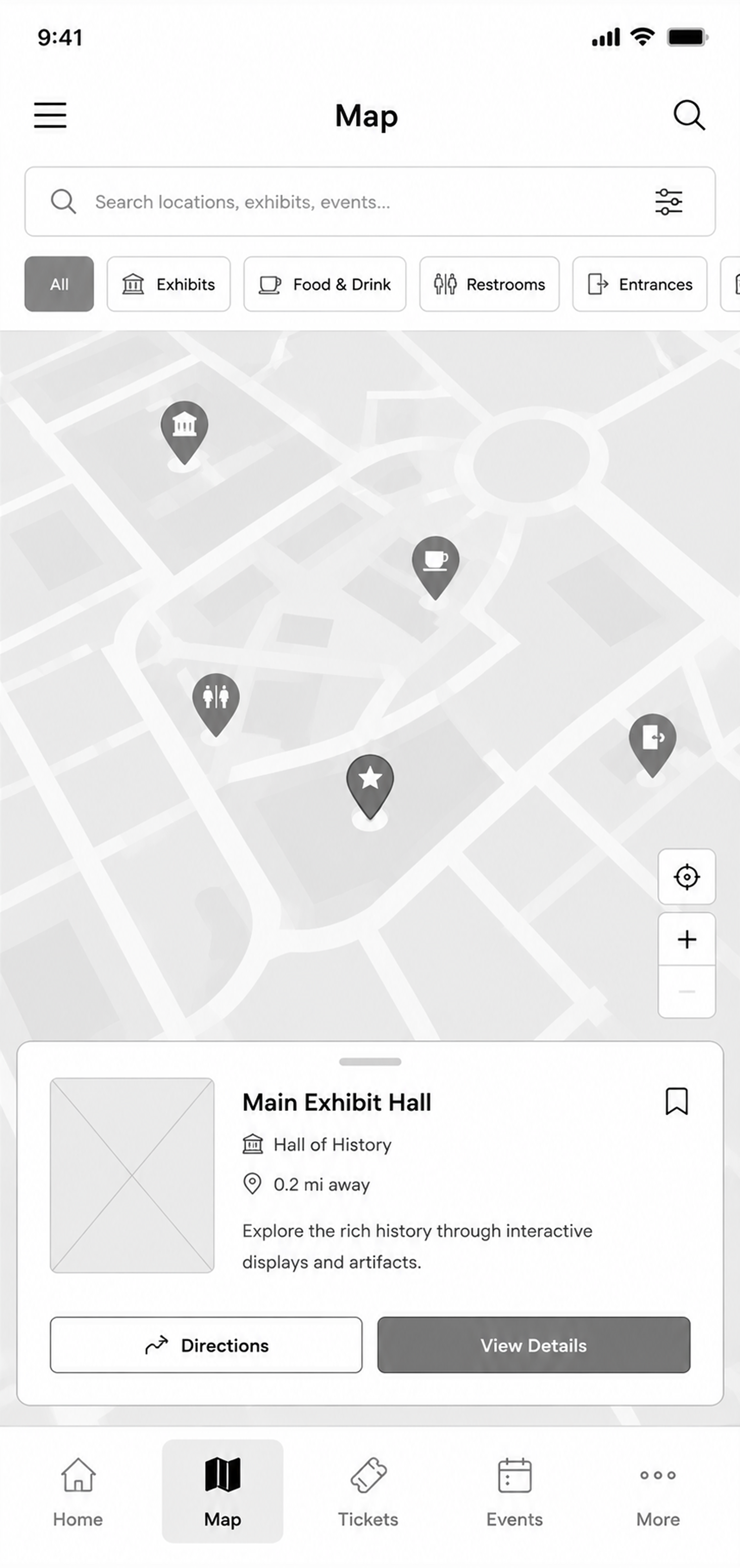
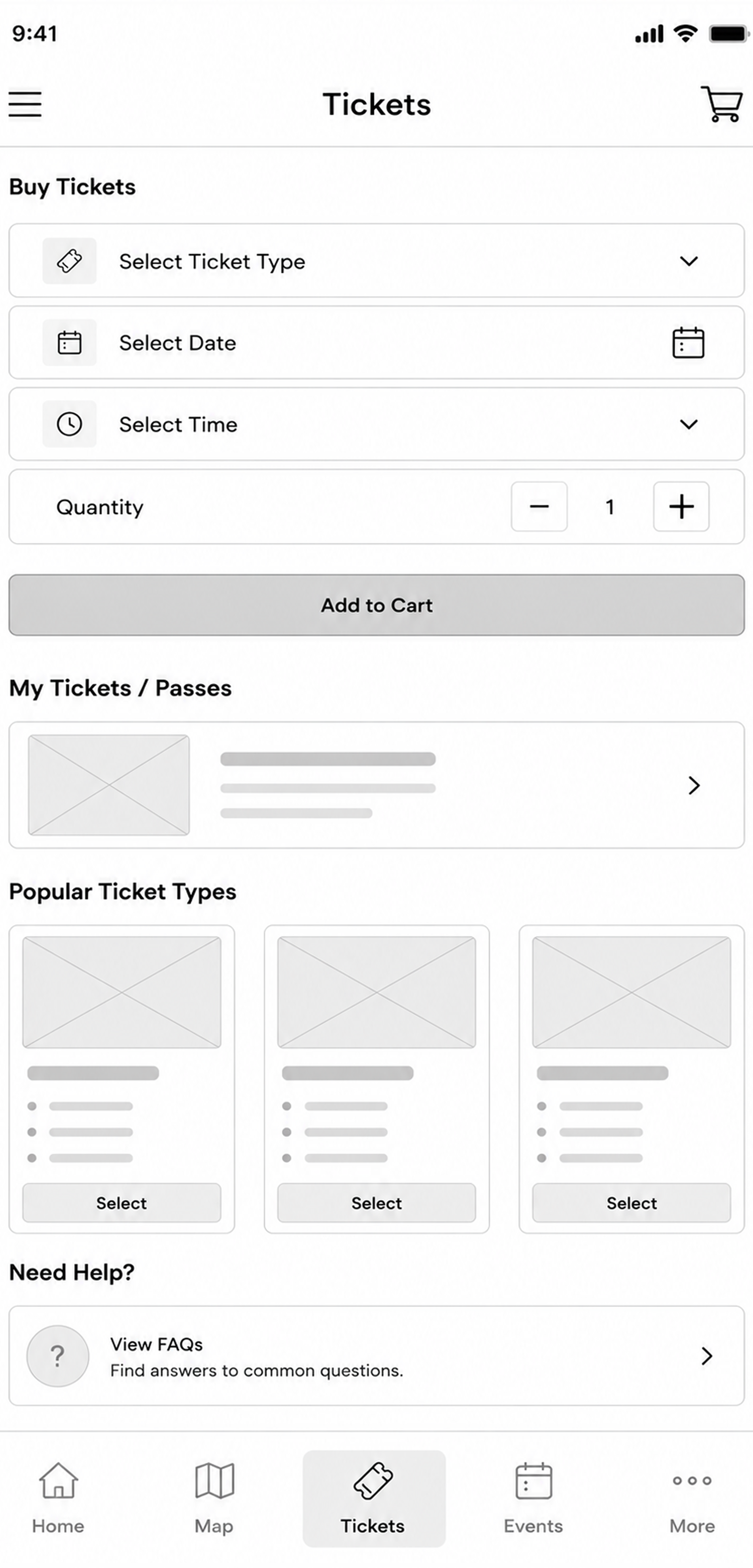
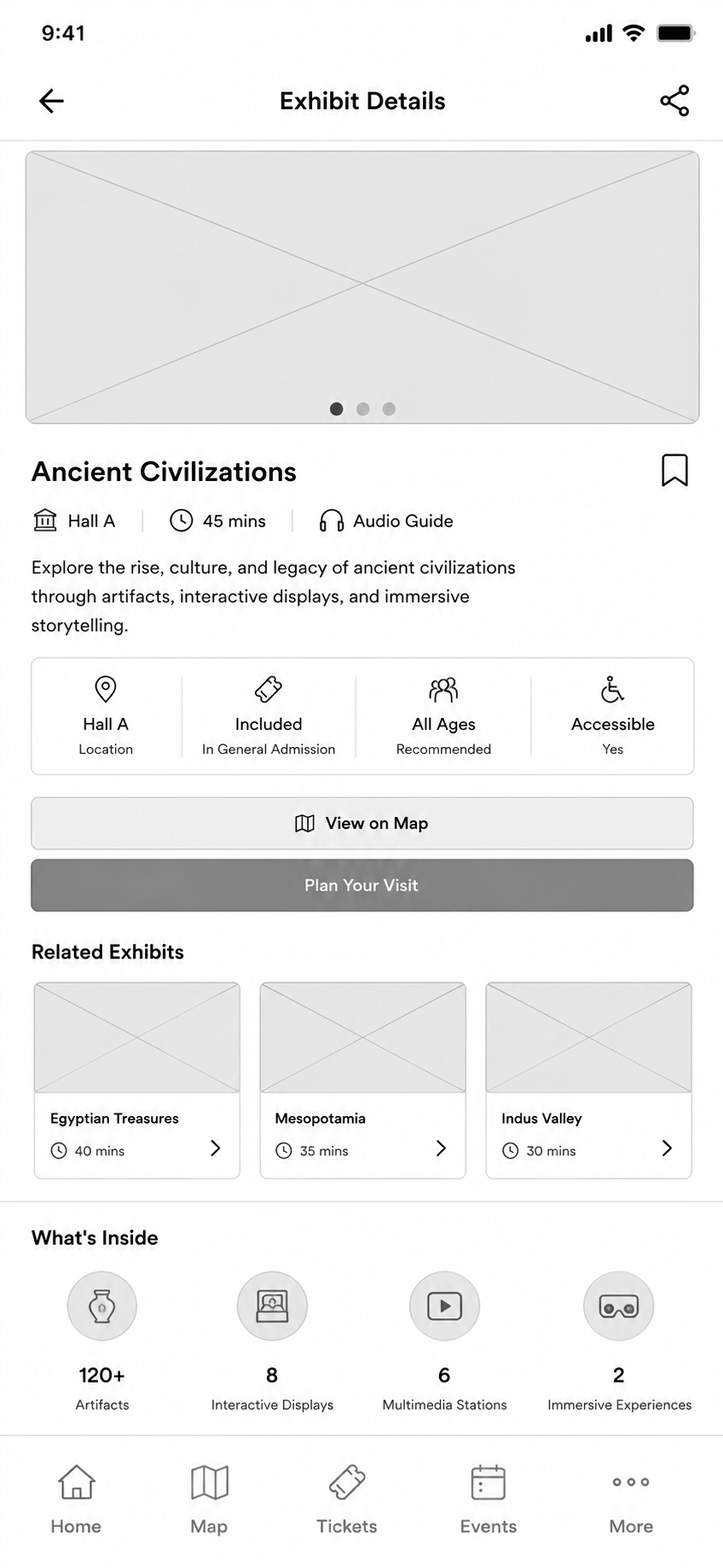
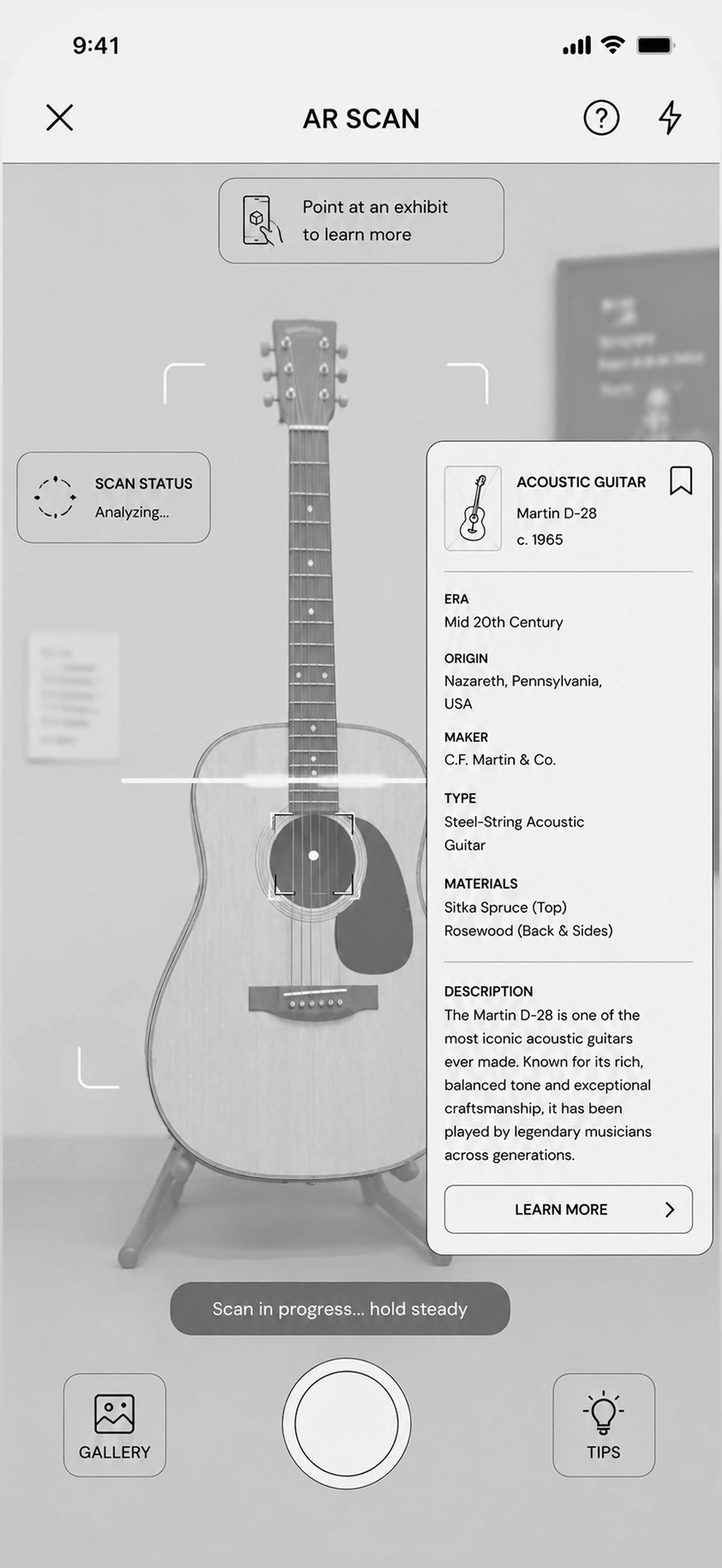
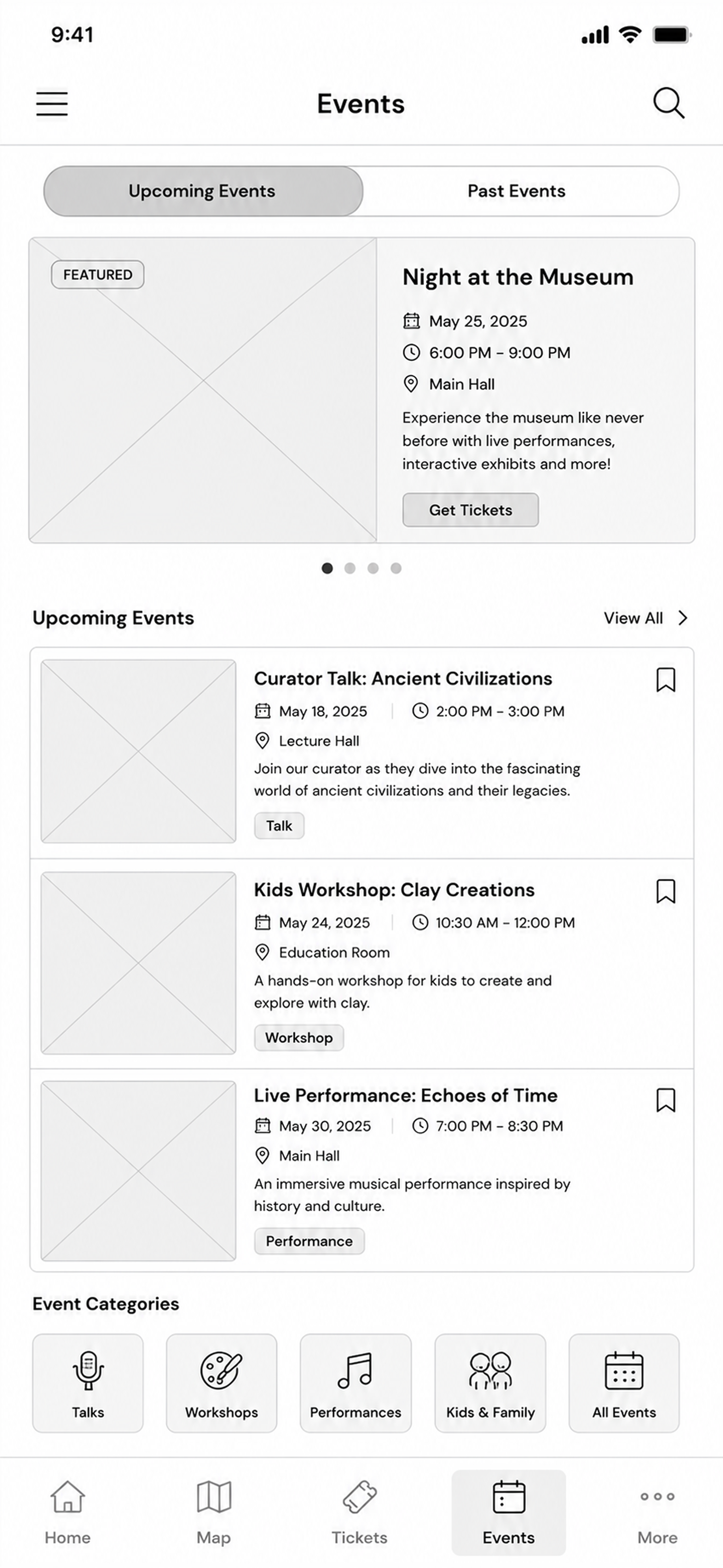
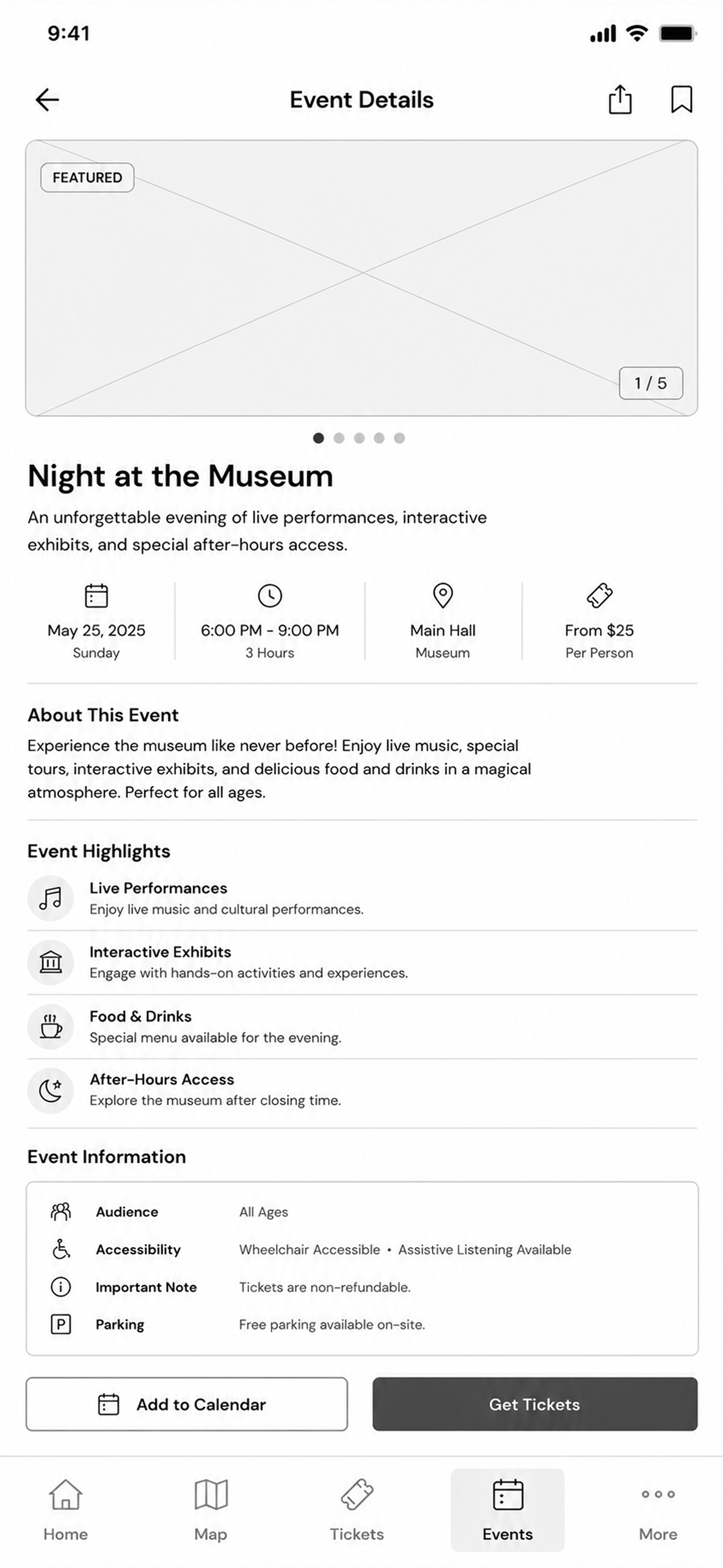
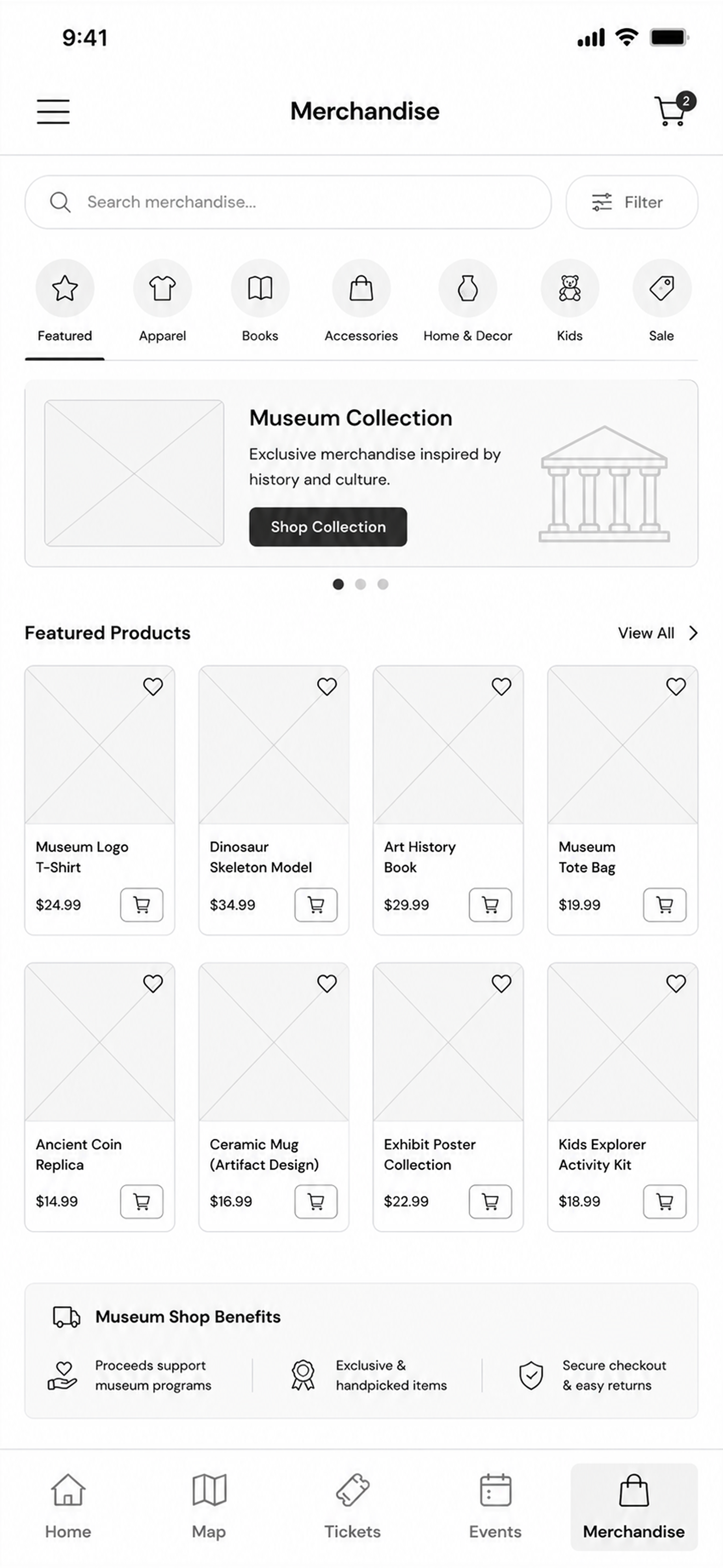
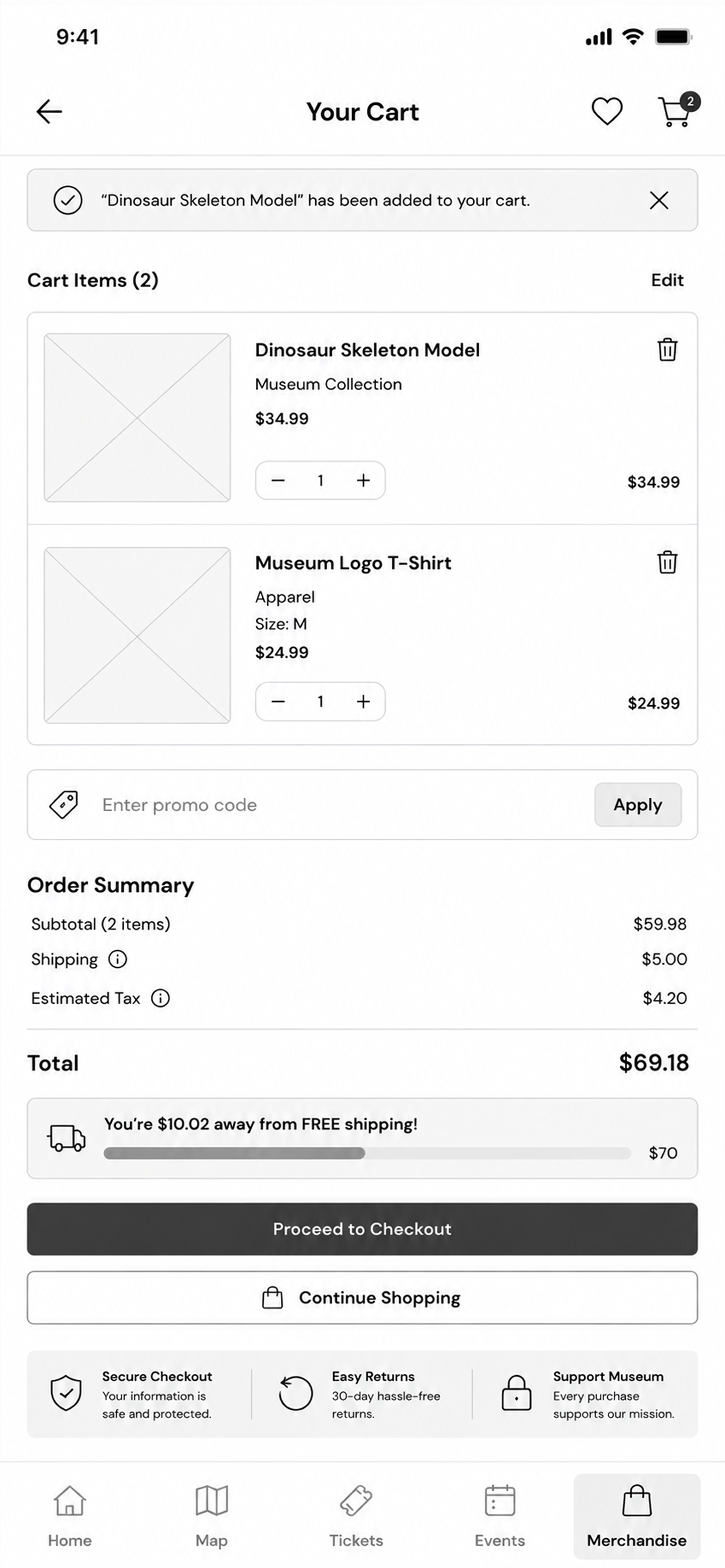
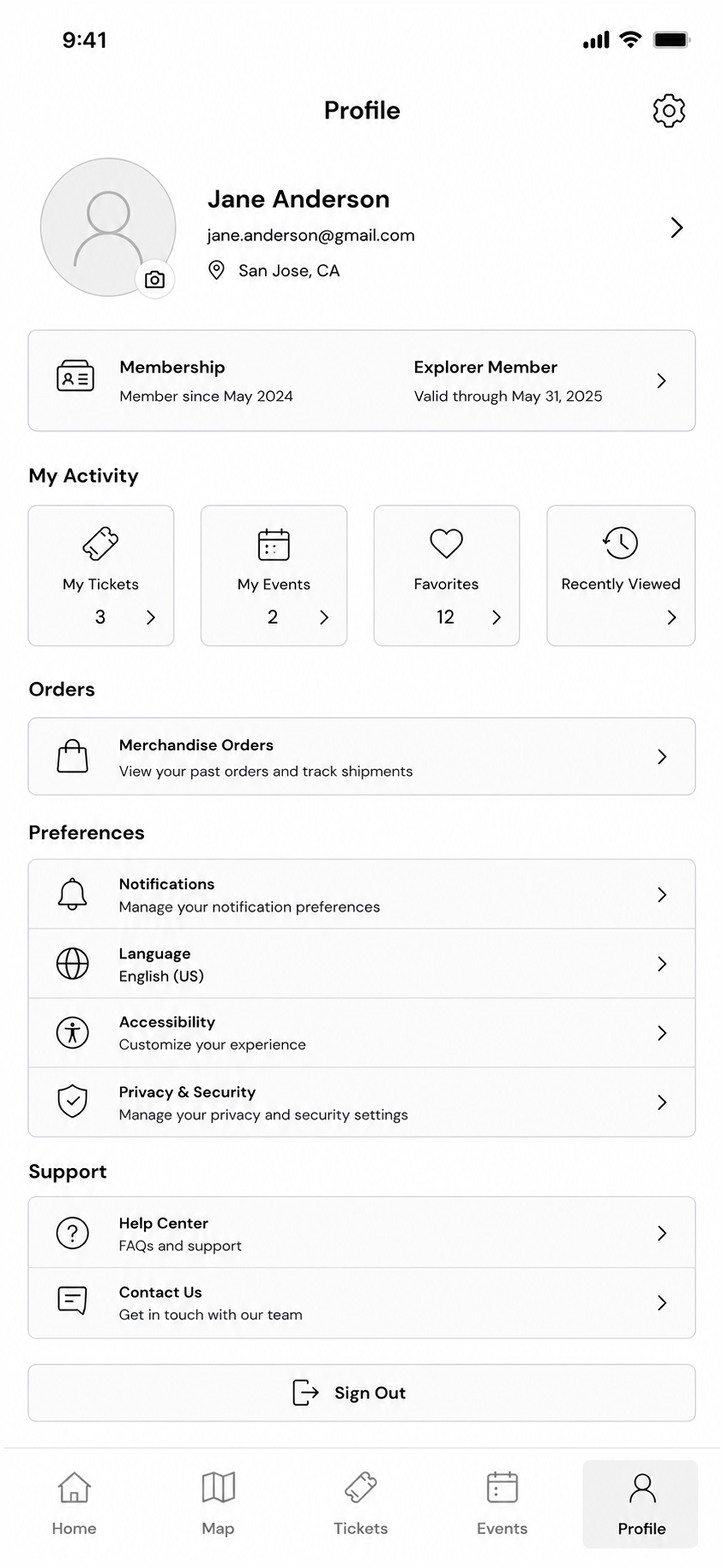
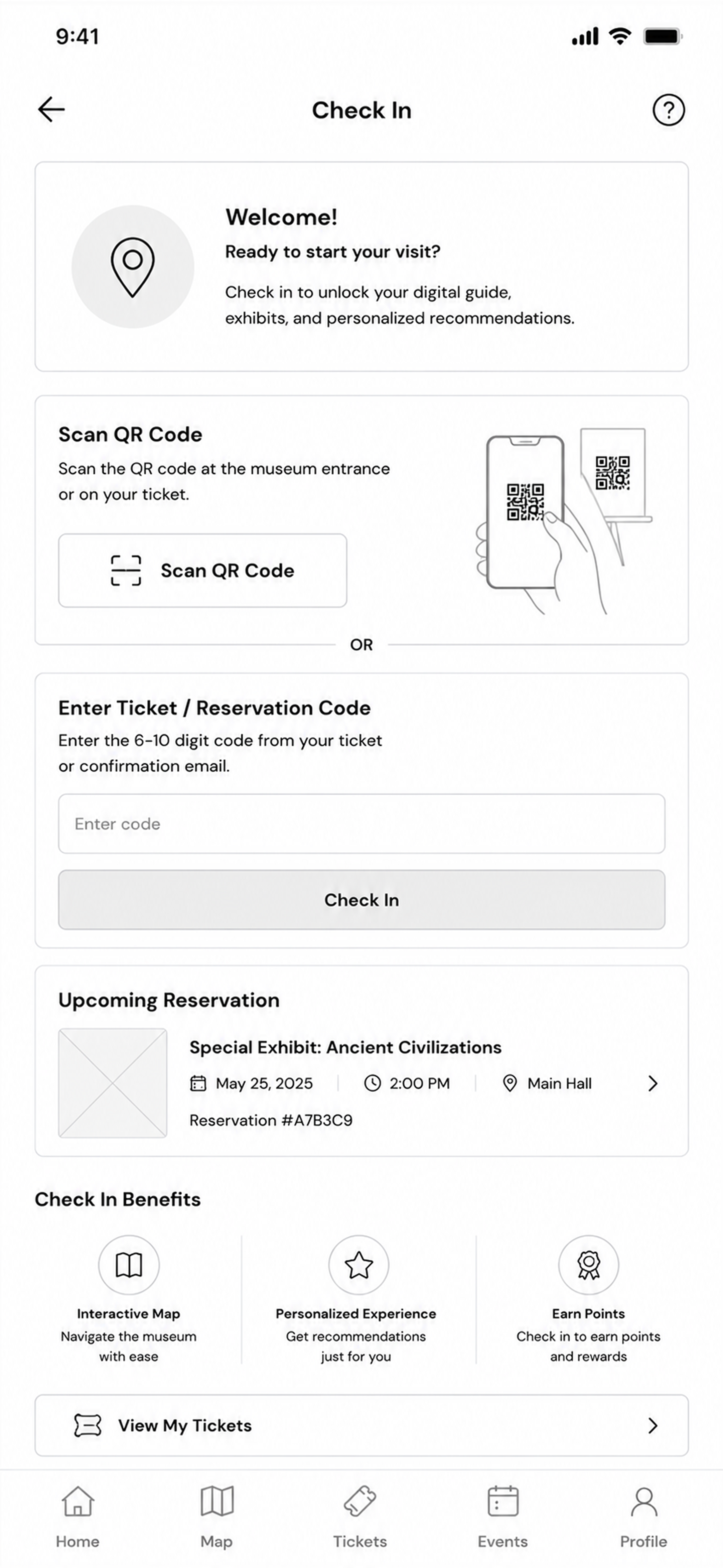
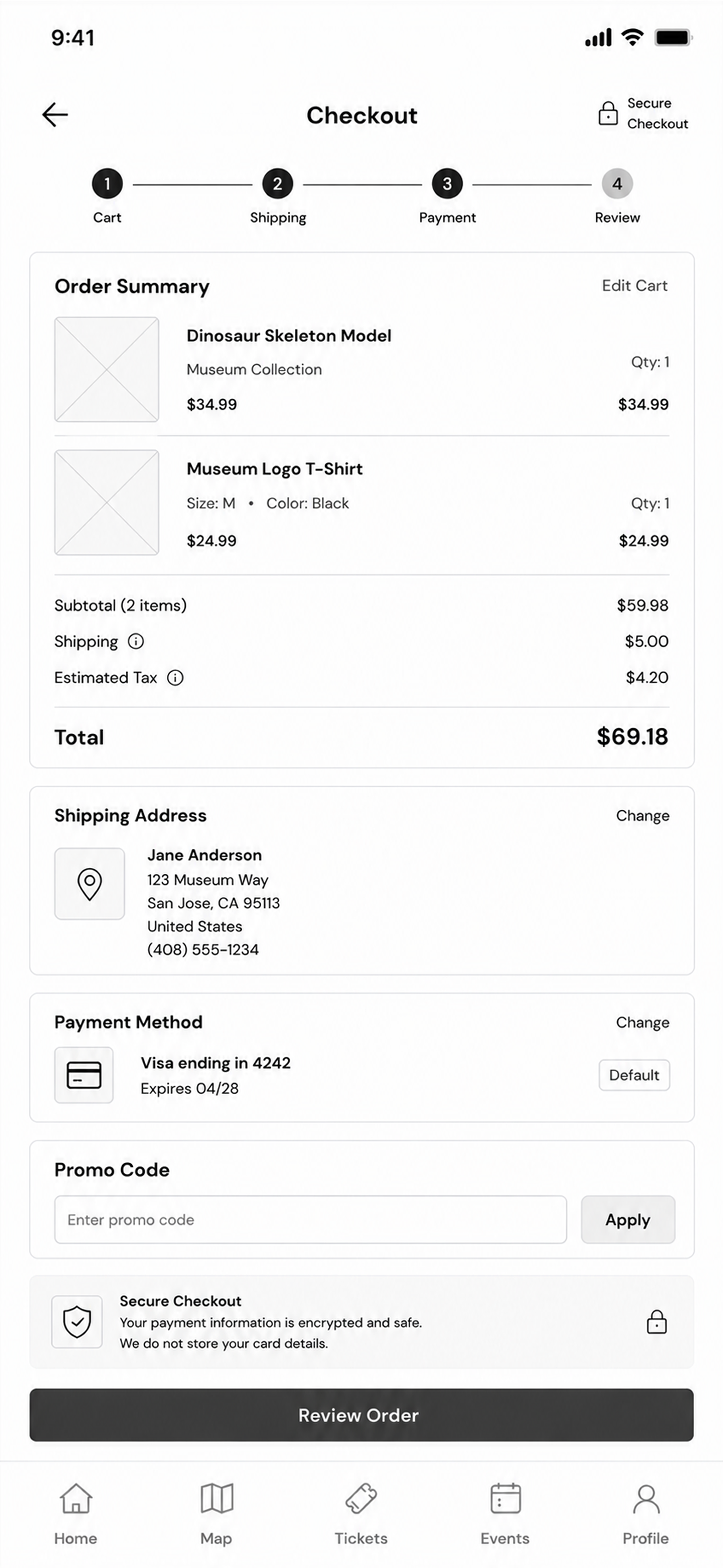
A tour built around you.
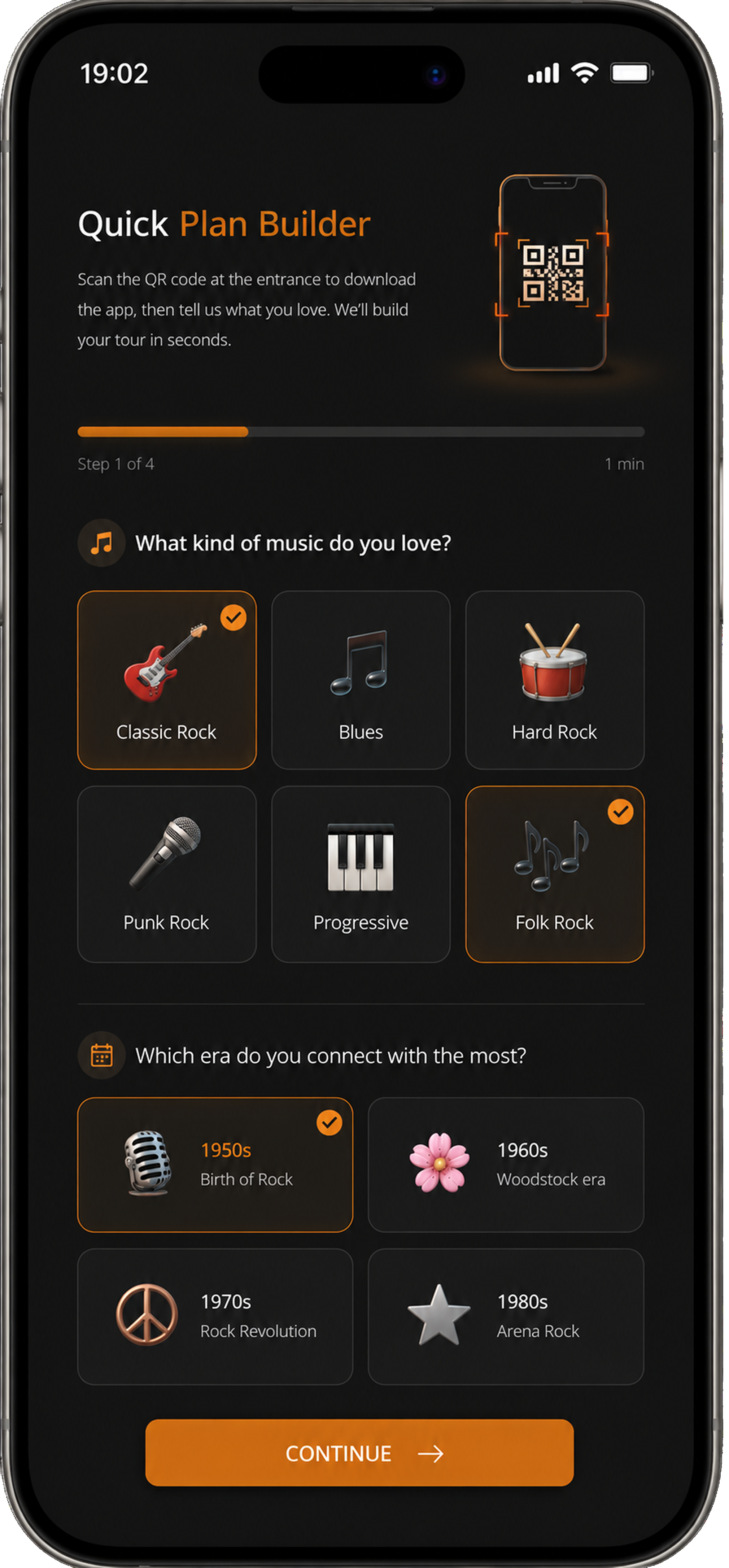
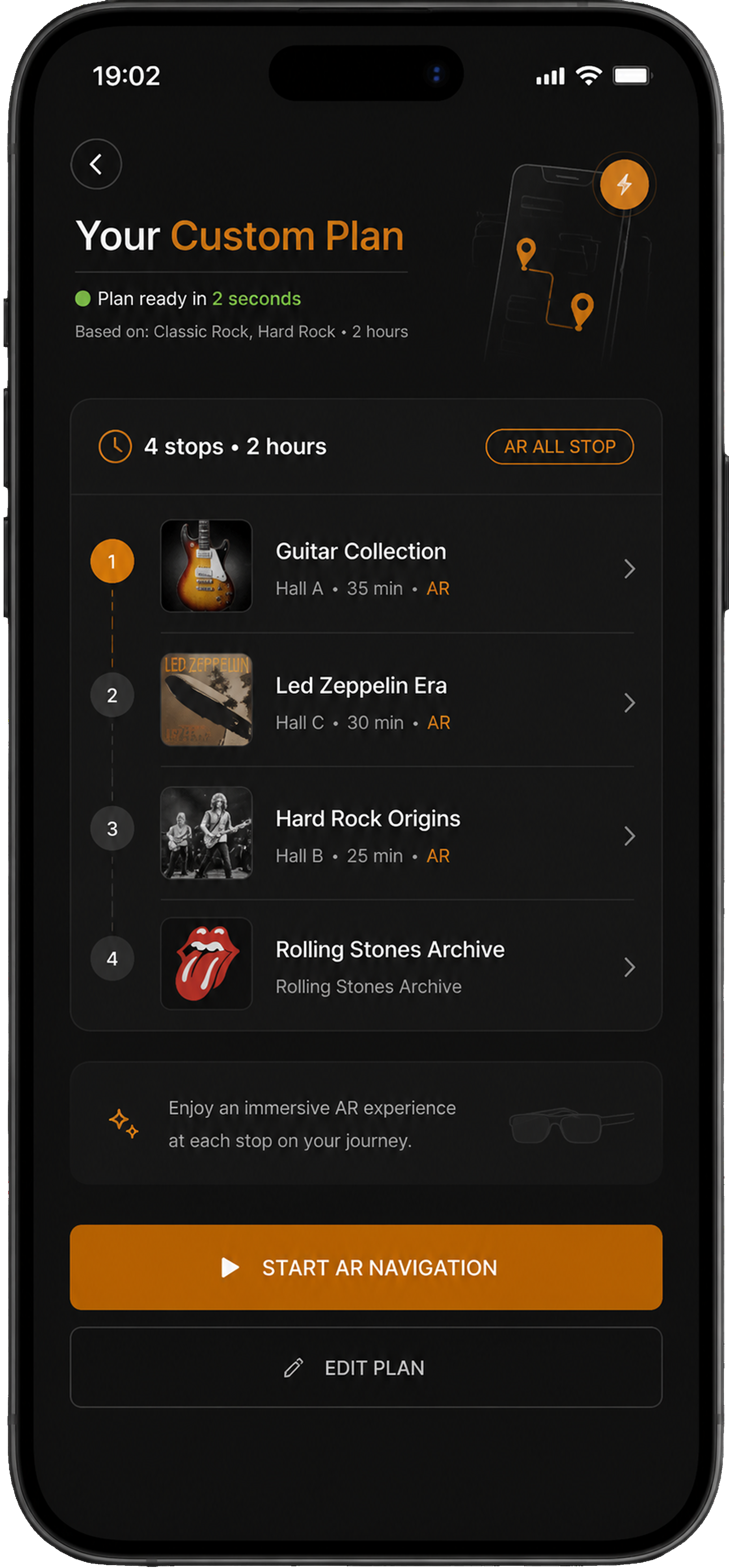
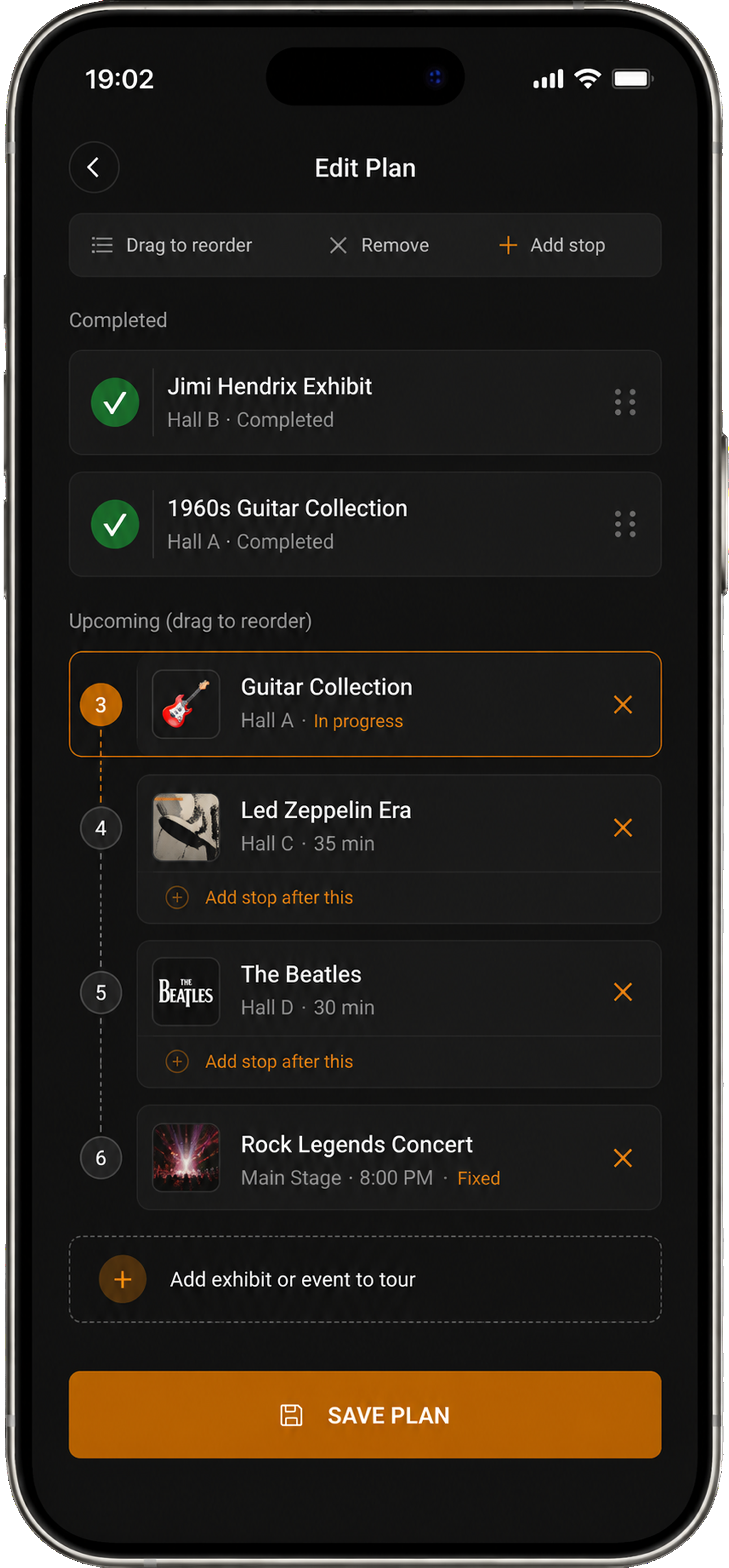
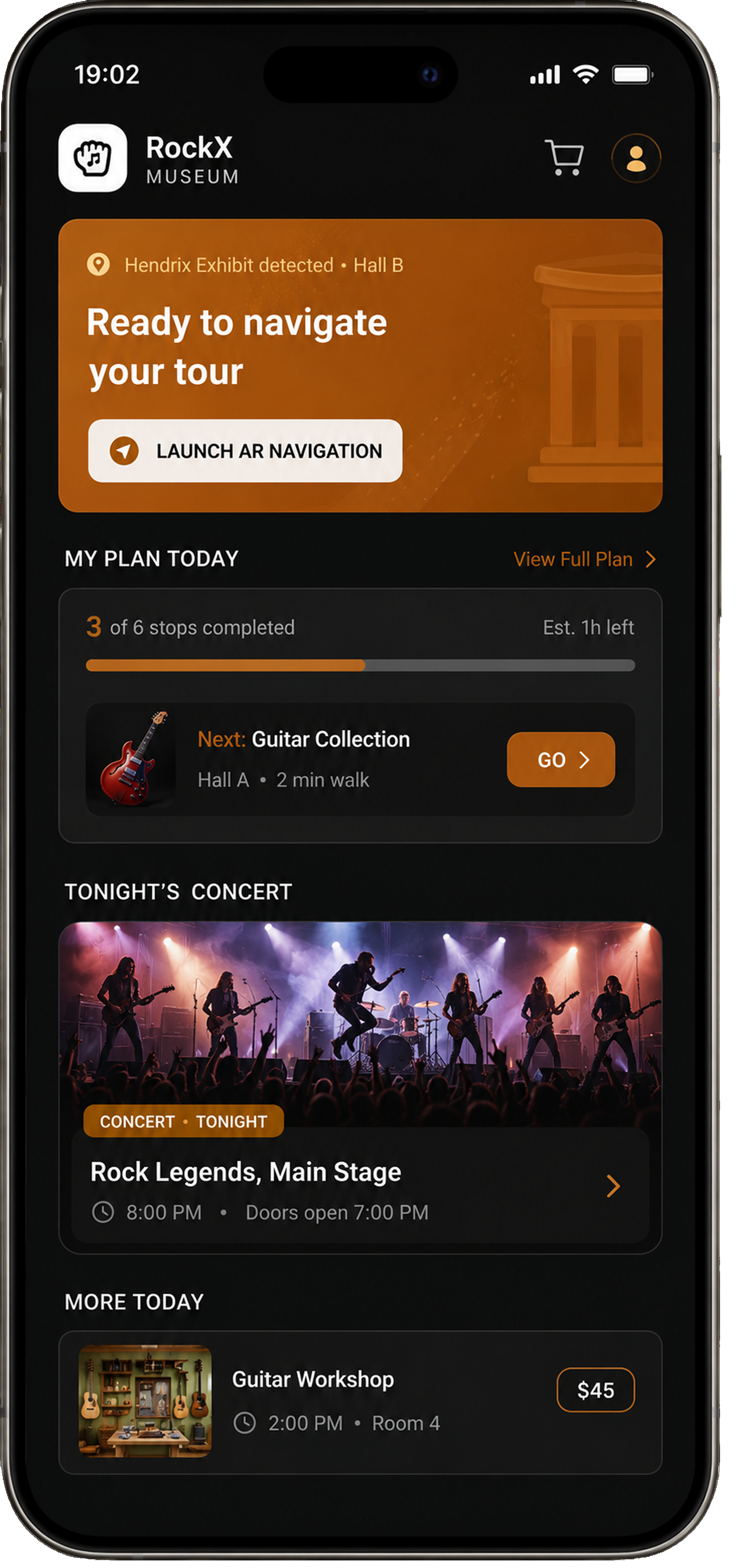
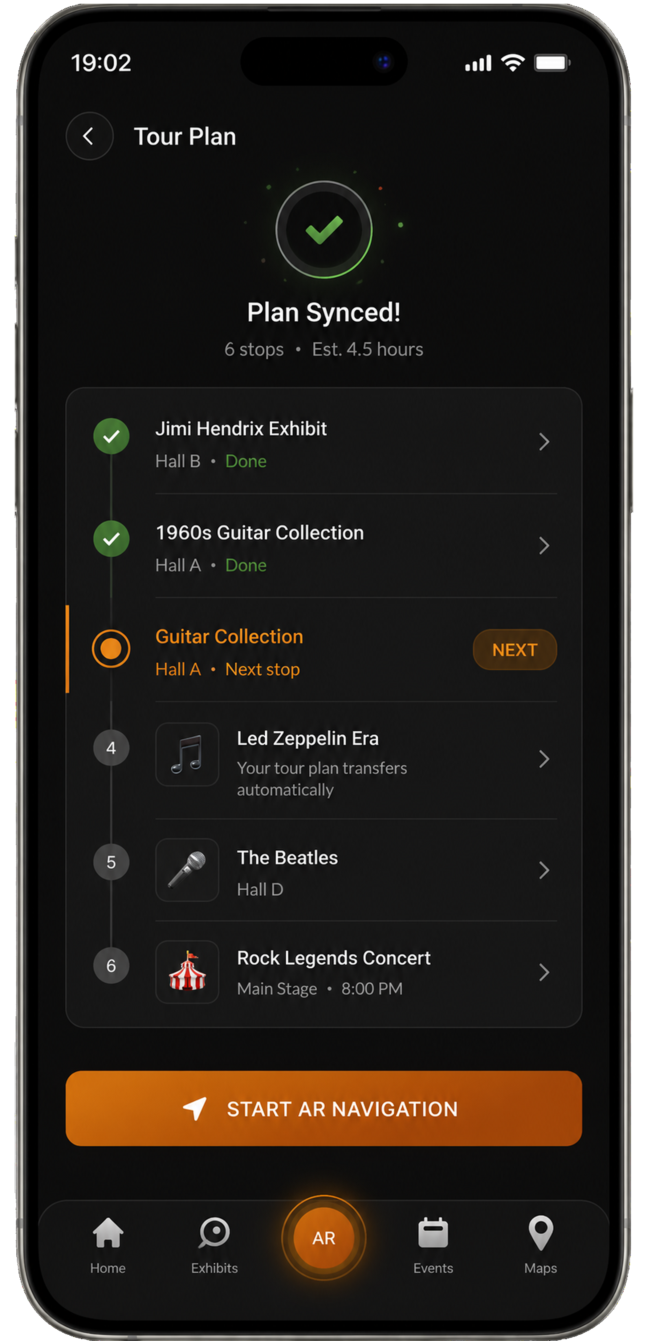
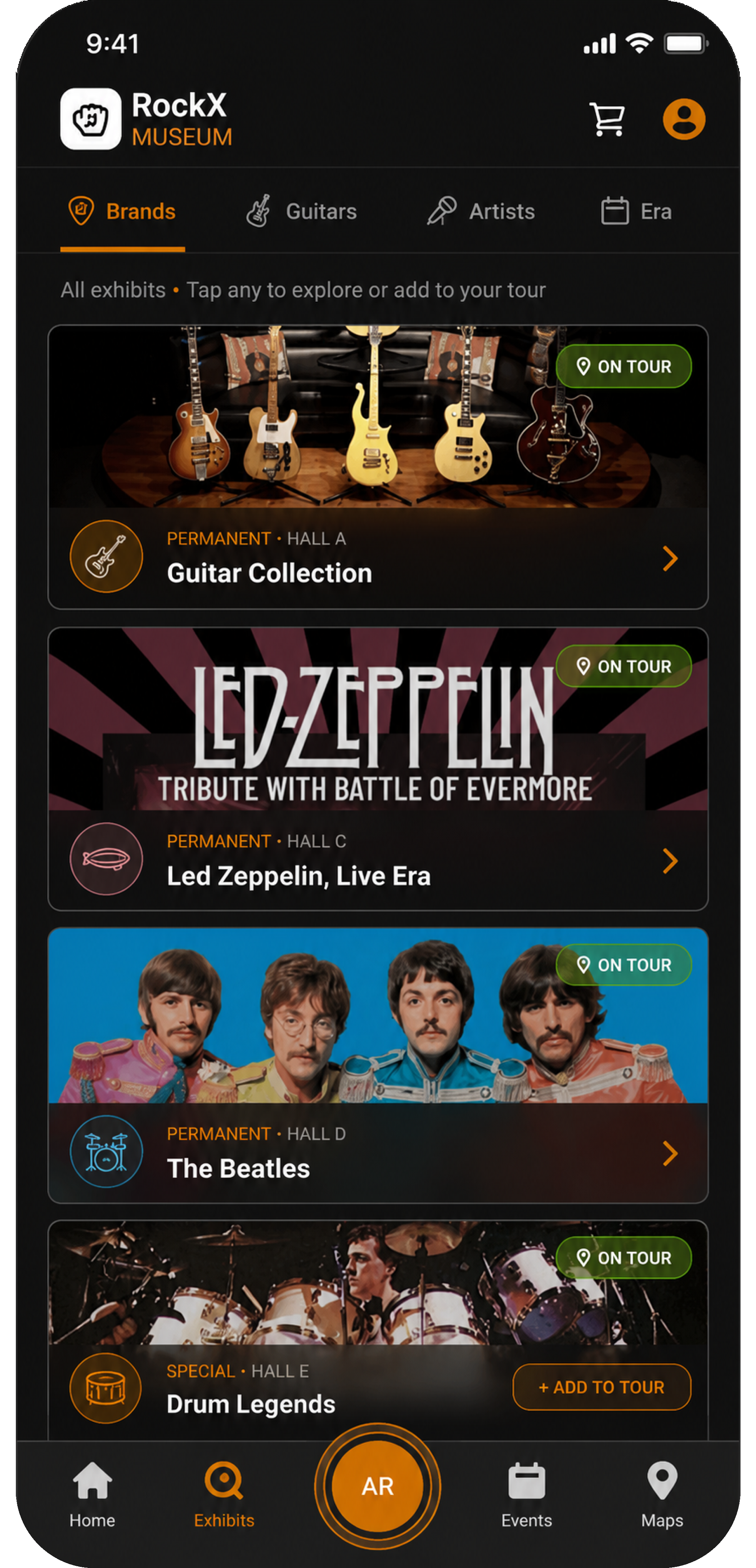
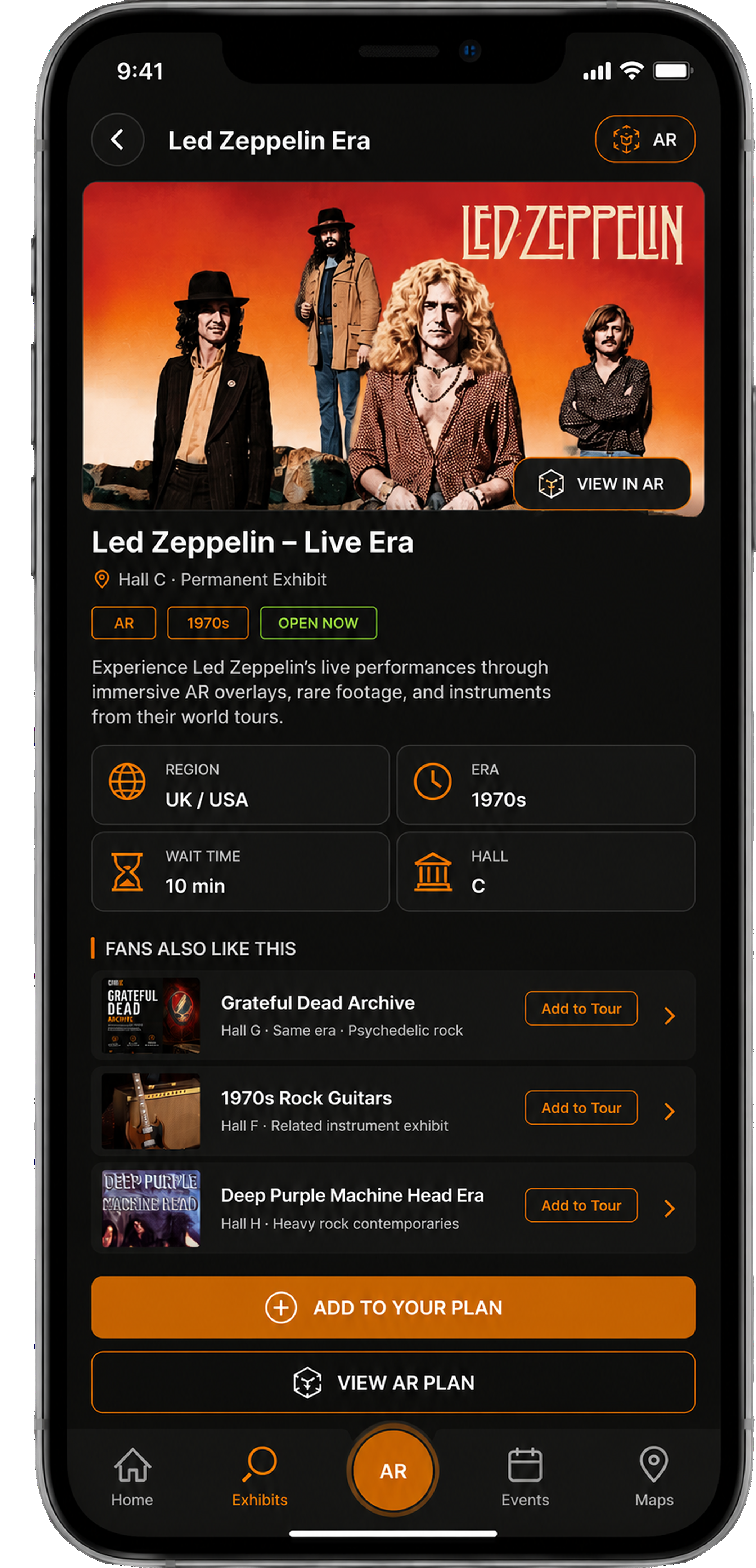
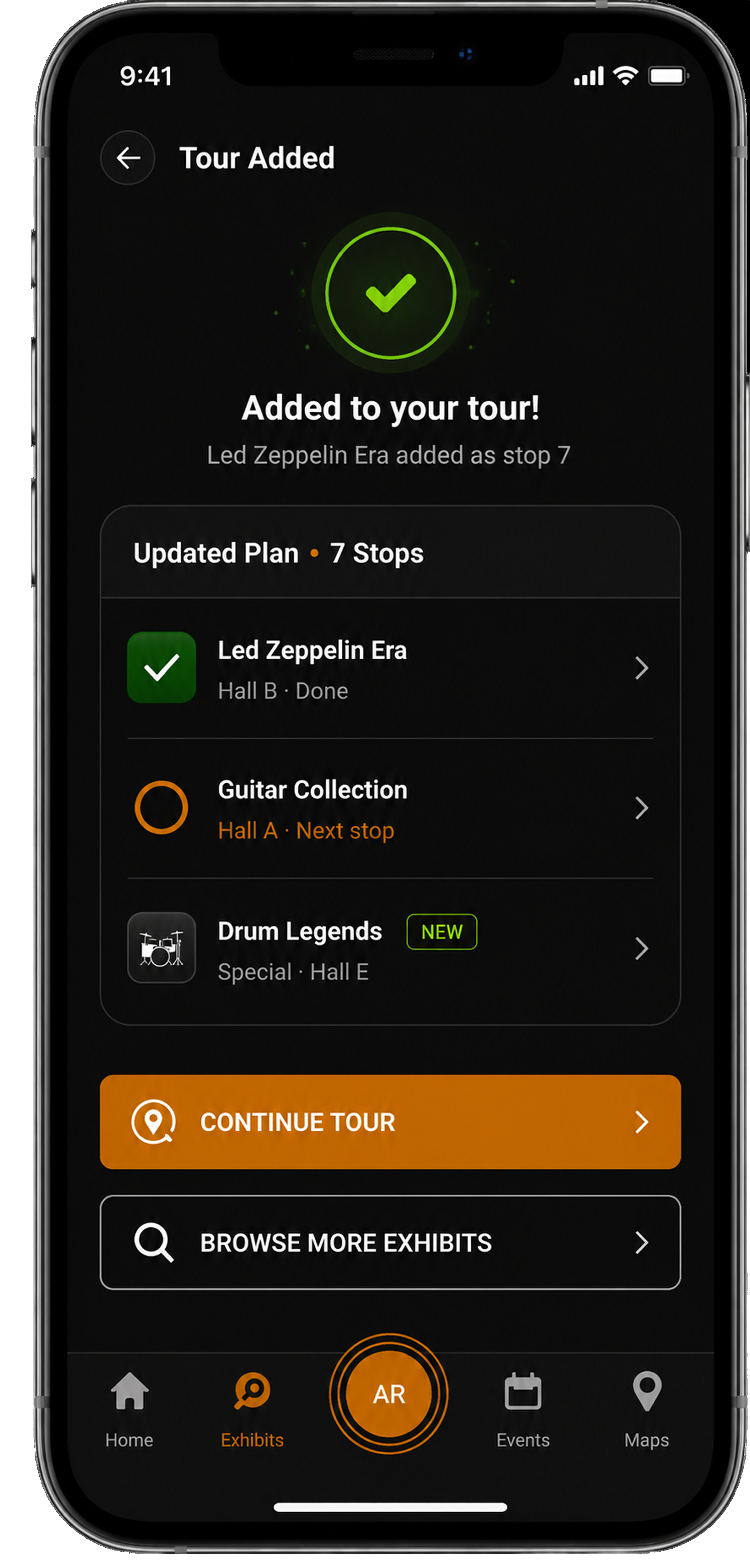
The Quick Plan Builder turns a cold start into a personalised route in under a minute. A visitor scans the entrance QR, picks the music and era they love, and the app assembles a tour of the exhibits worth their time, no prior planning, no app-store friction.
Wayfinding, reimagined with AR.
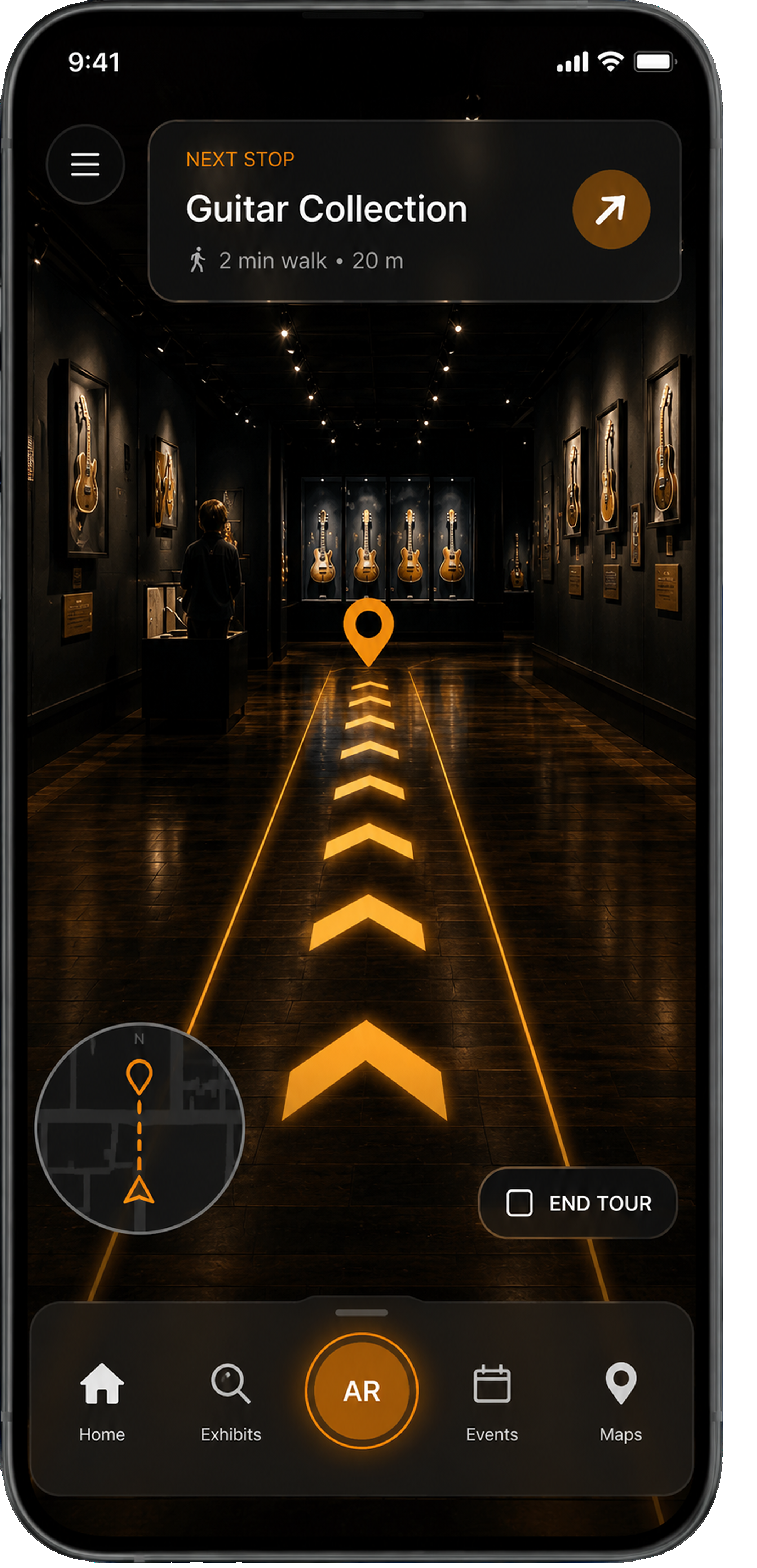
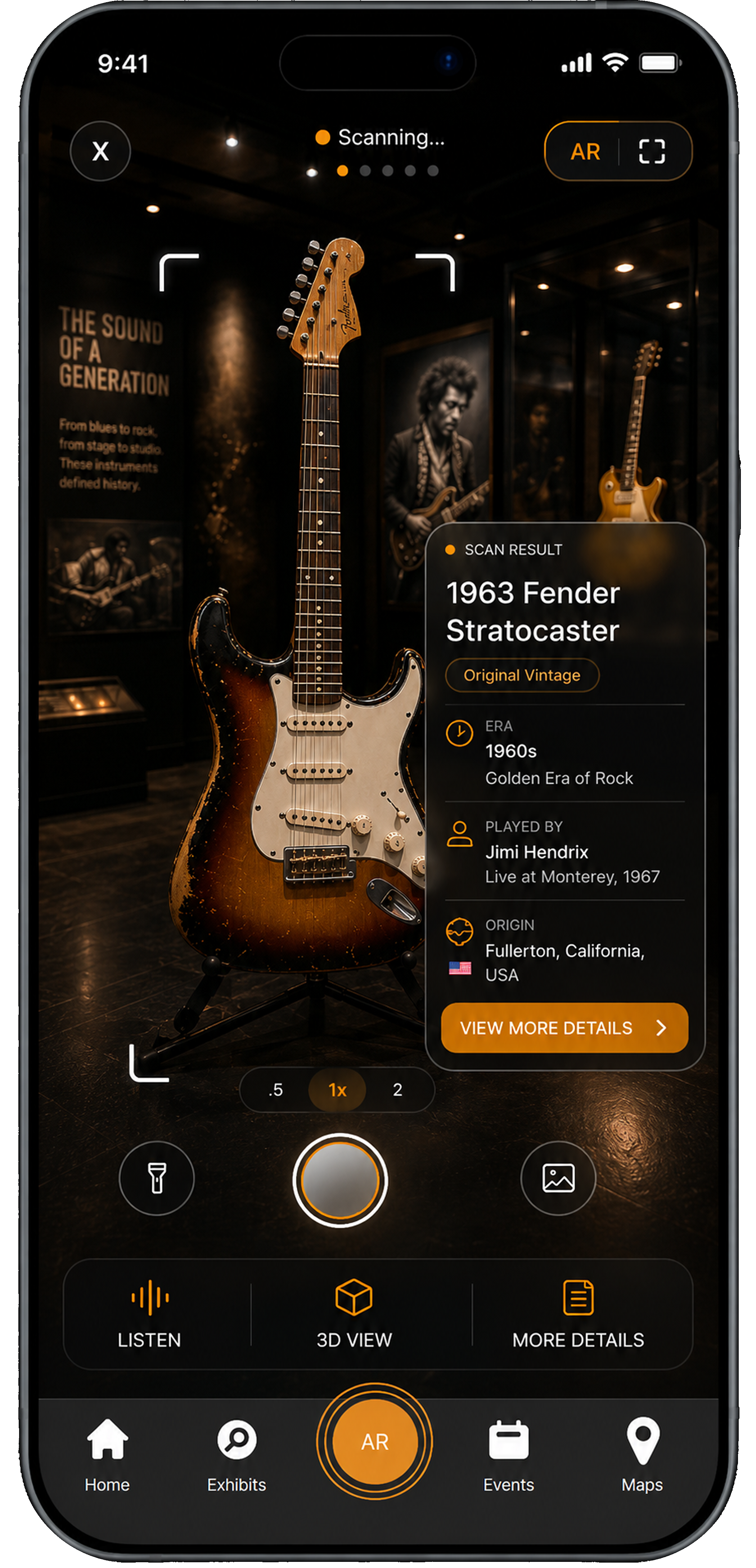
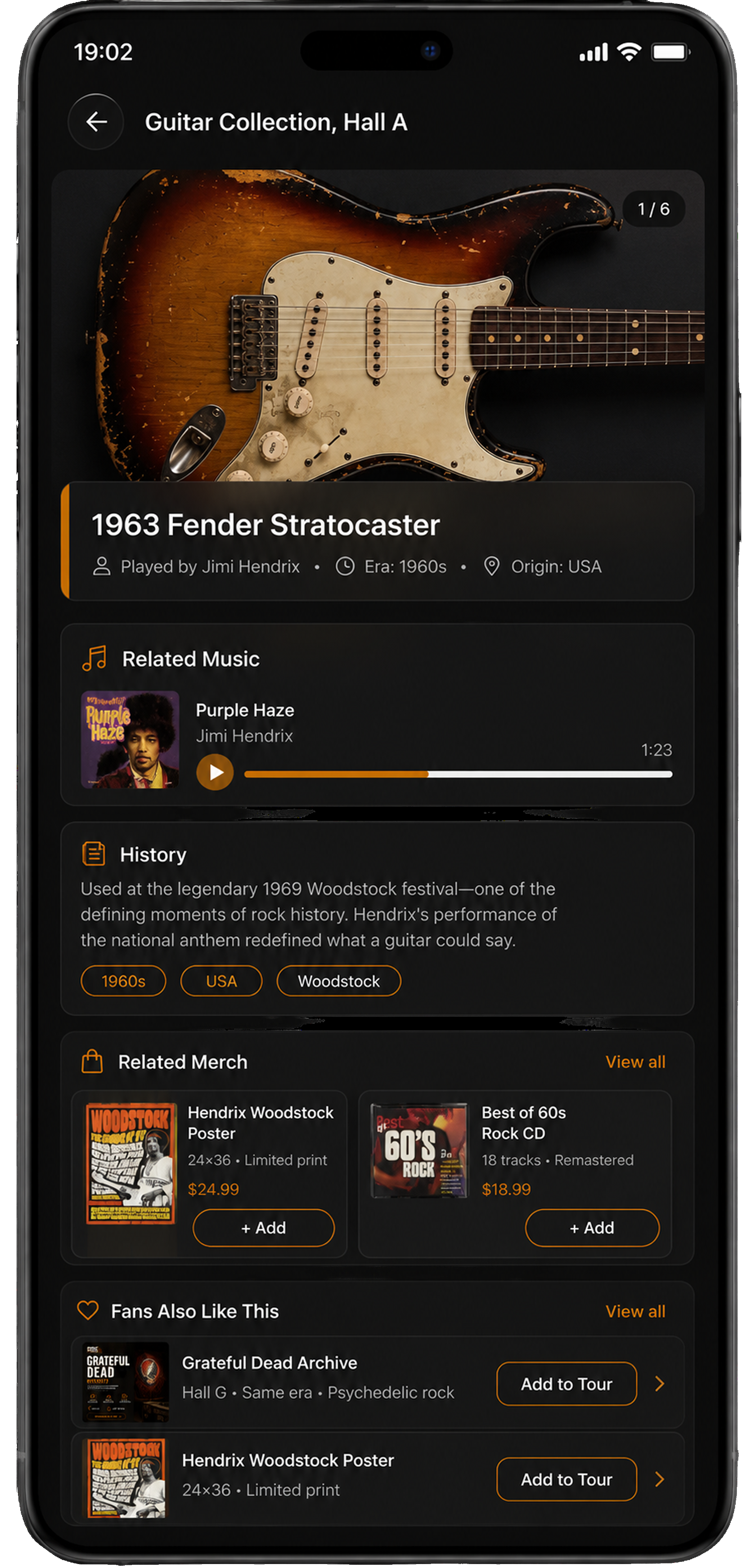
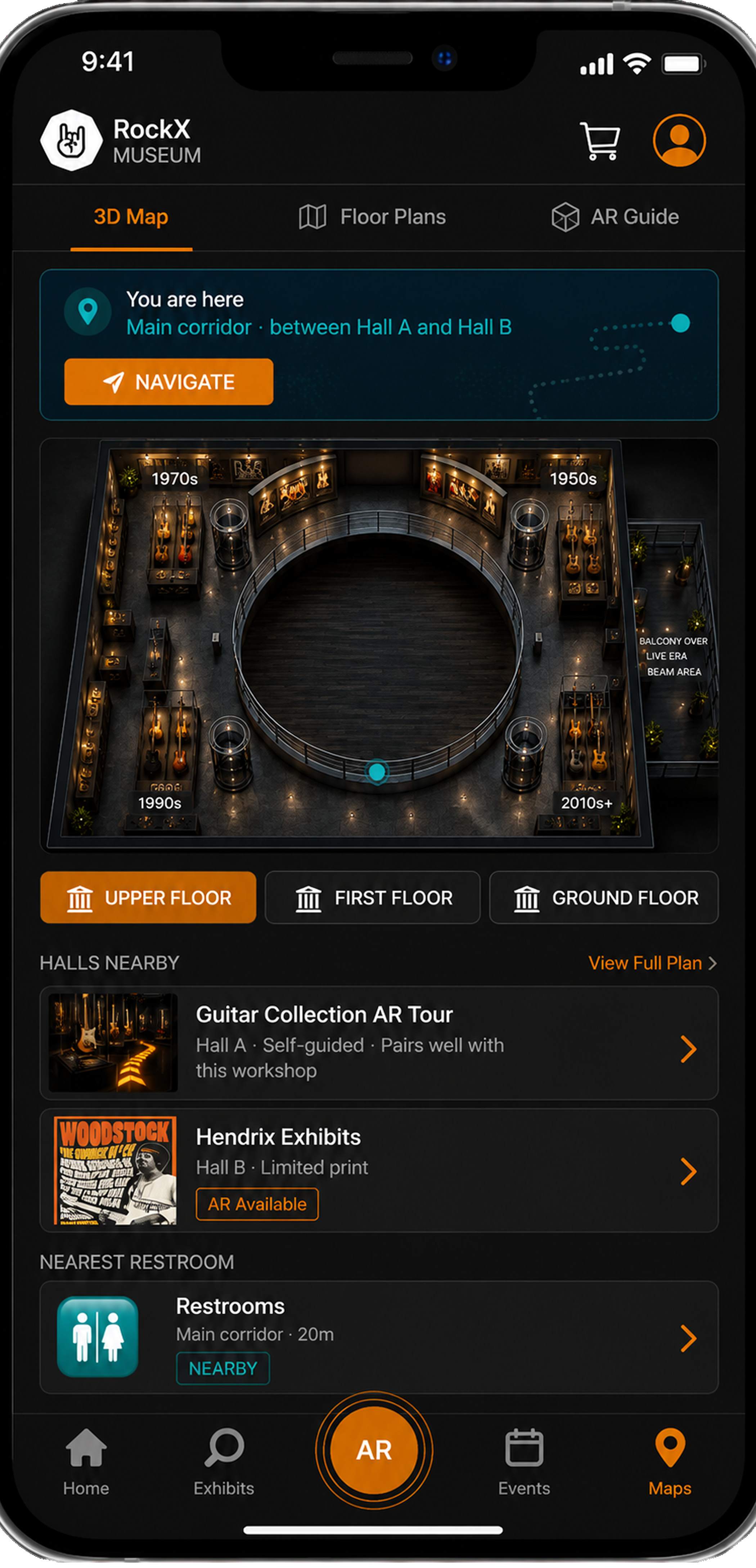
The signature of the app: instead of a paper map, RockX paints a glowing path on the floor through your camera, with a live mini-map and a 3-D model of the museum to orient by. Getting lost stops being part of the visit.
Live at the concert.
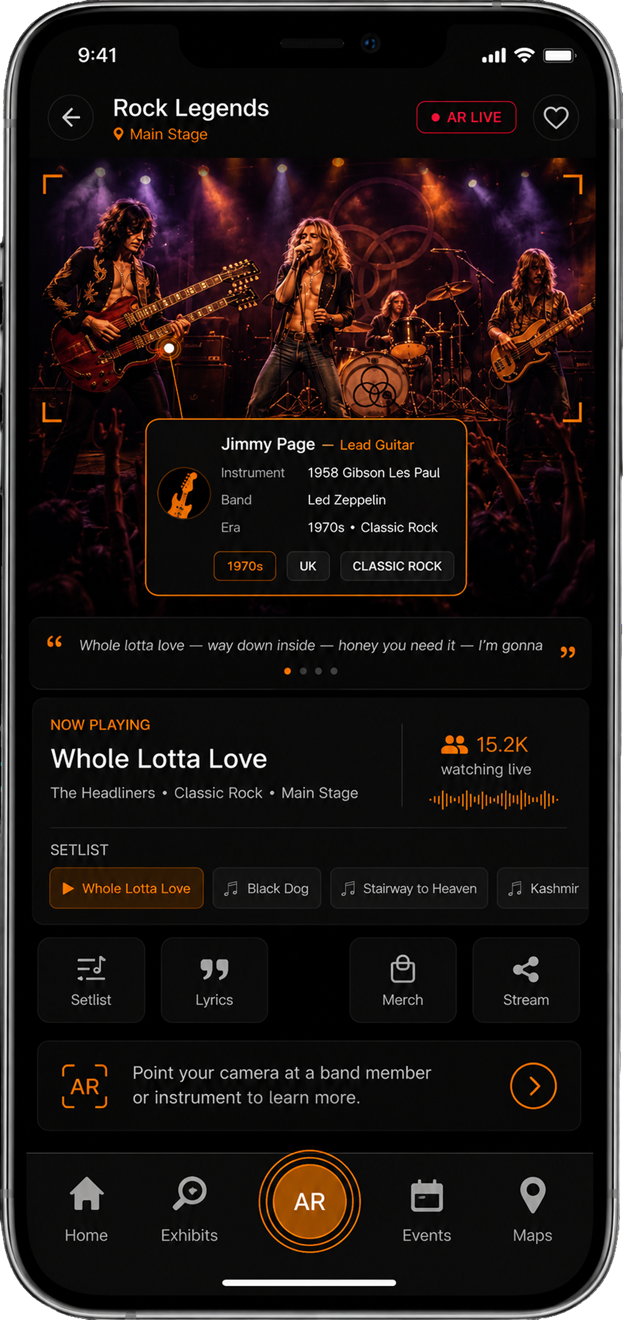
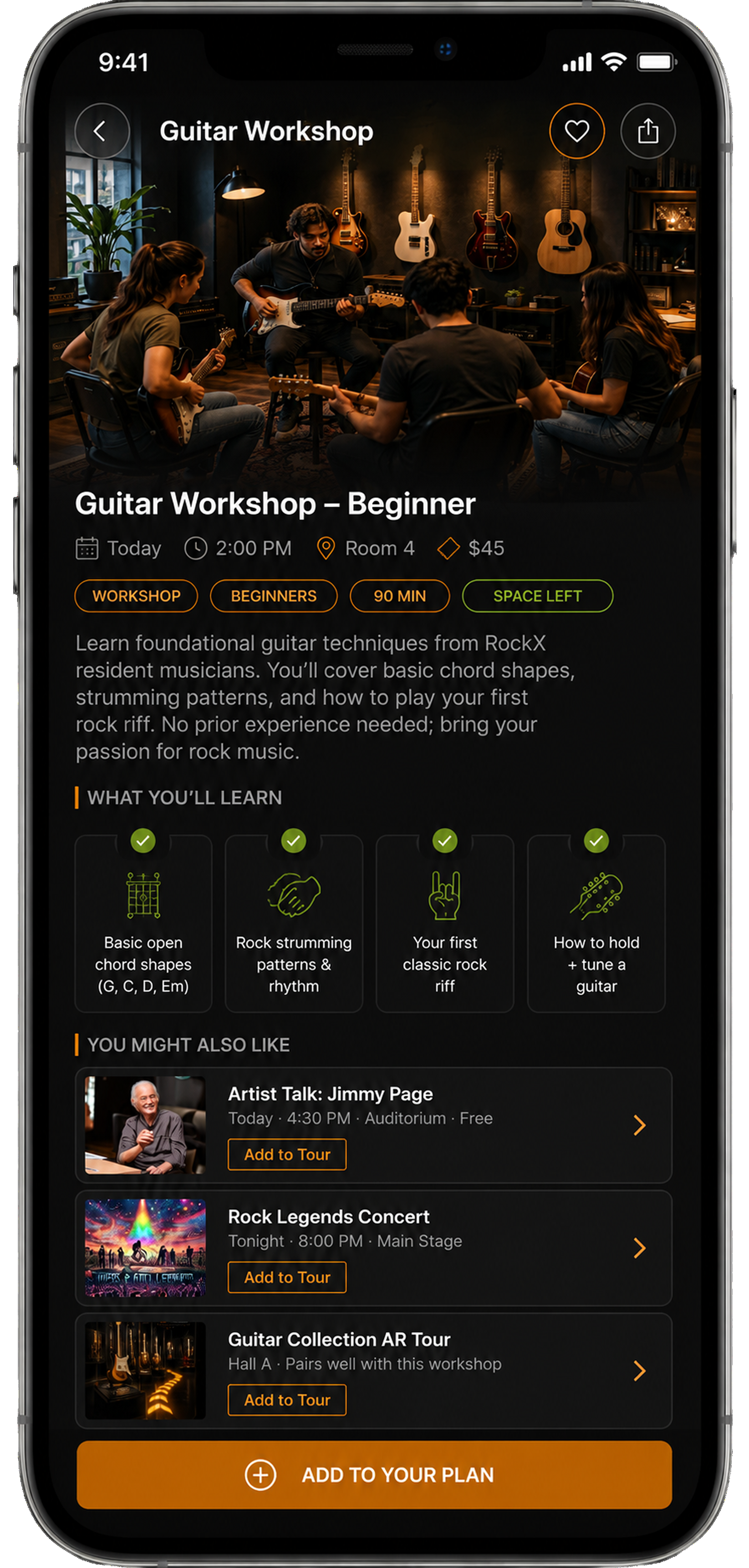
RockX turns a live show into something you can follow along with: see who's on the main stage, track the setlist song by song, browse related media and merch, and stream the moment straight to your socials.
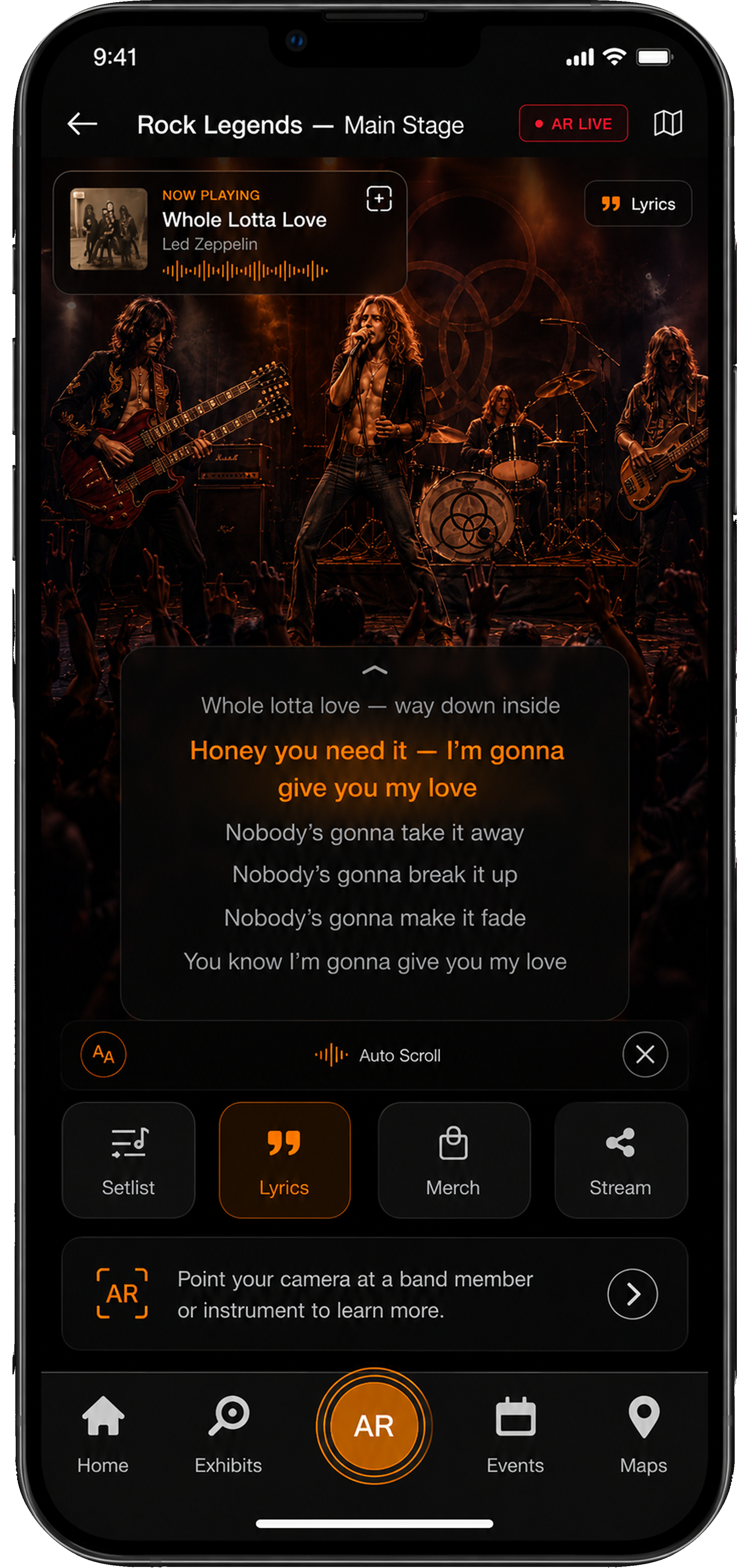
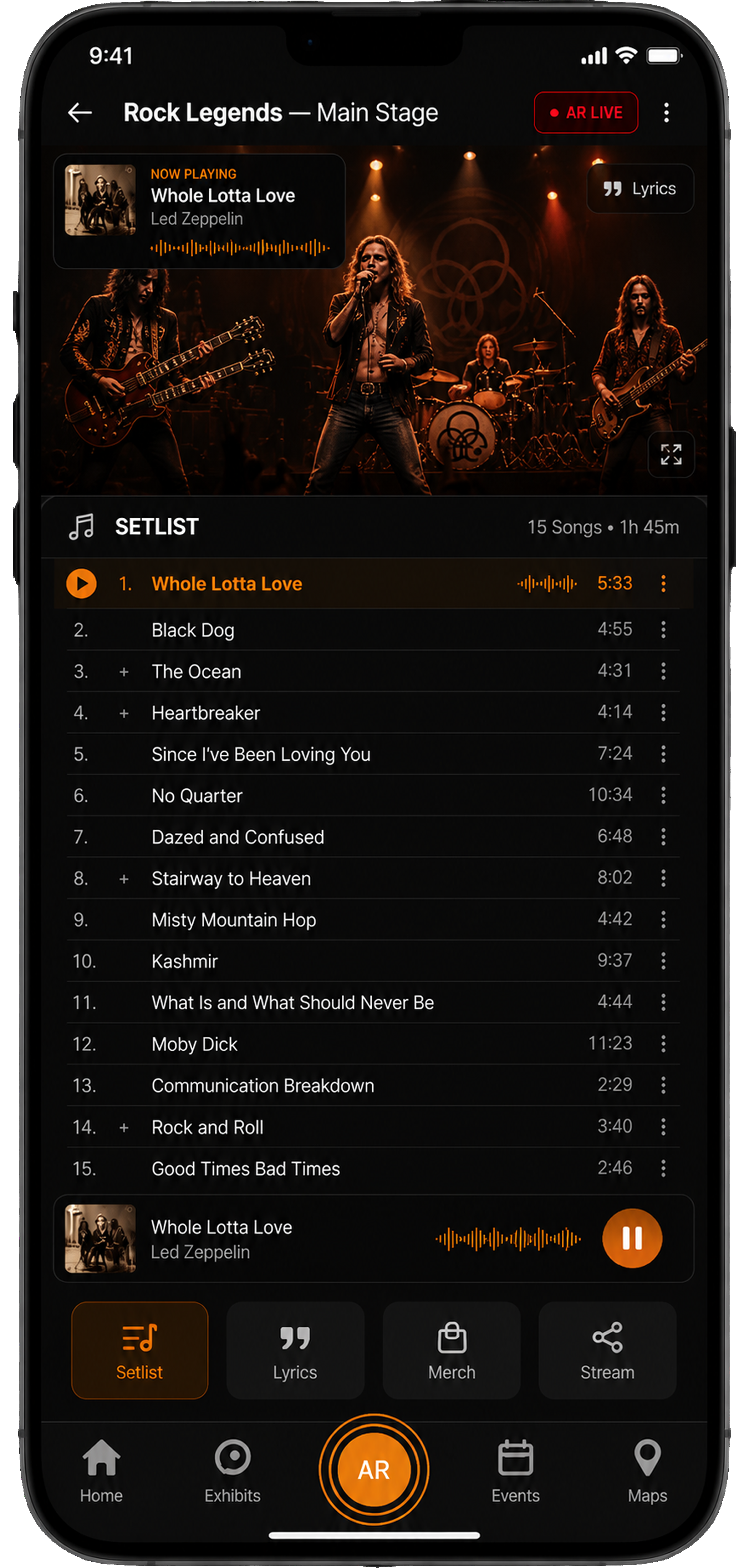
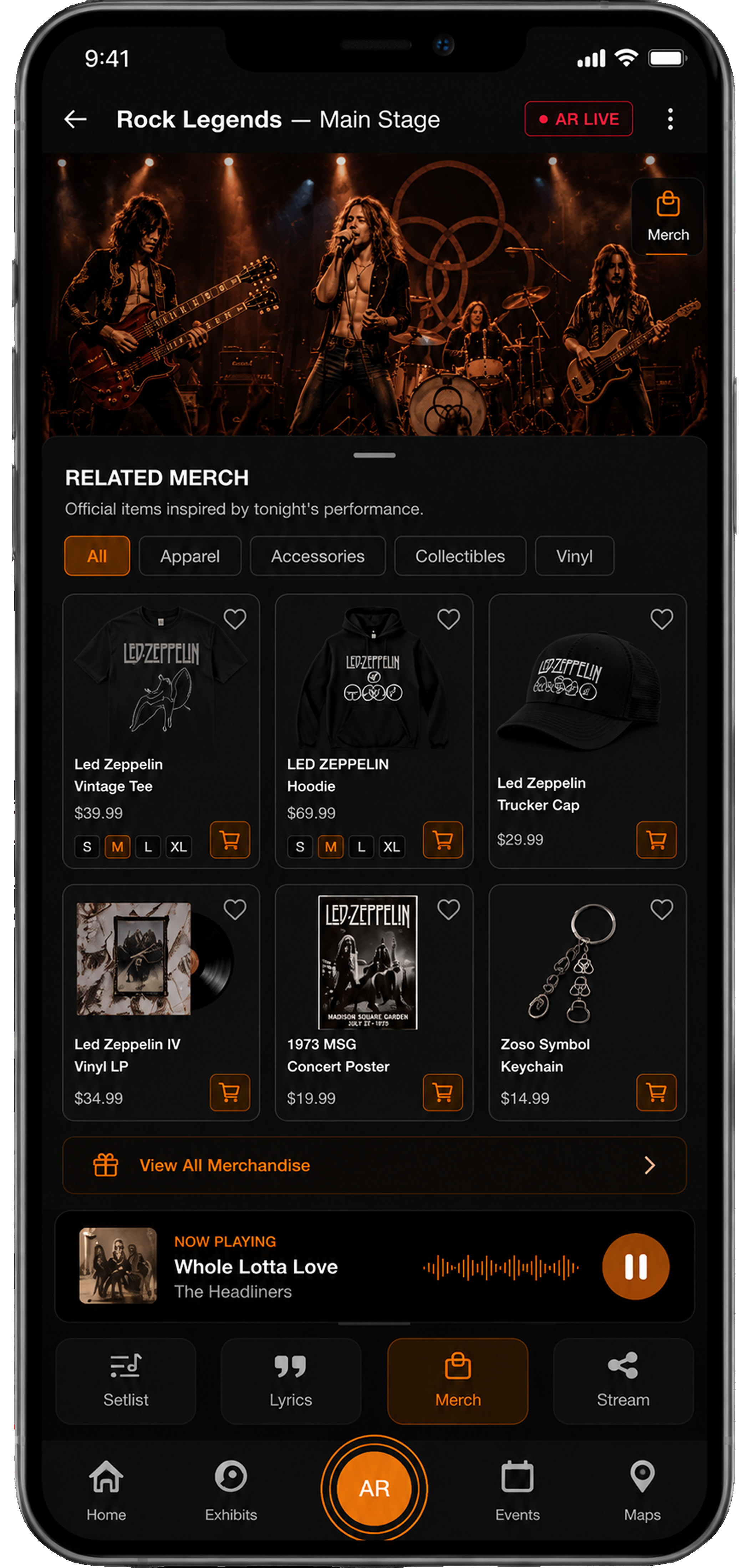
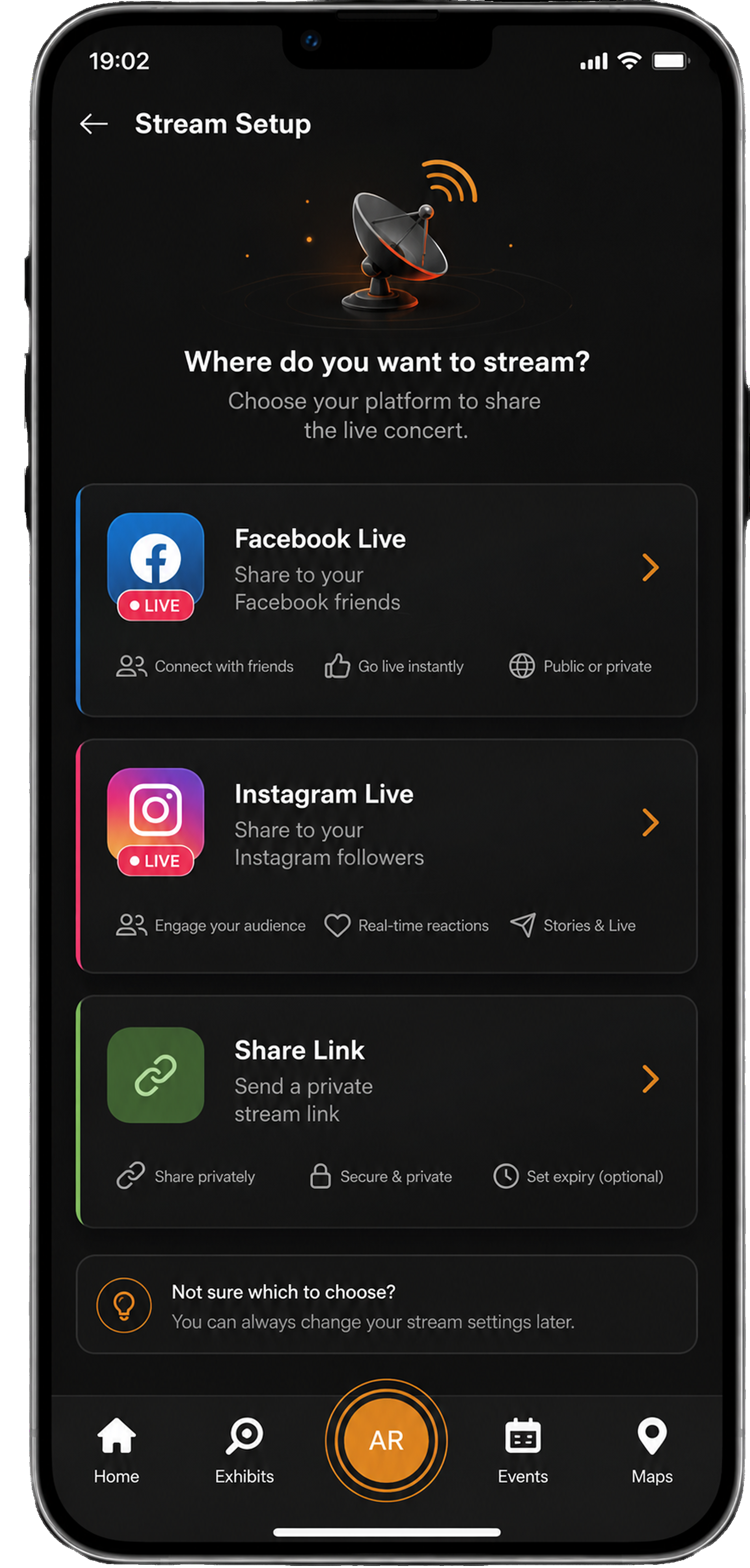
Across the whole visit.
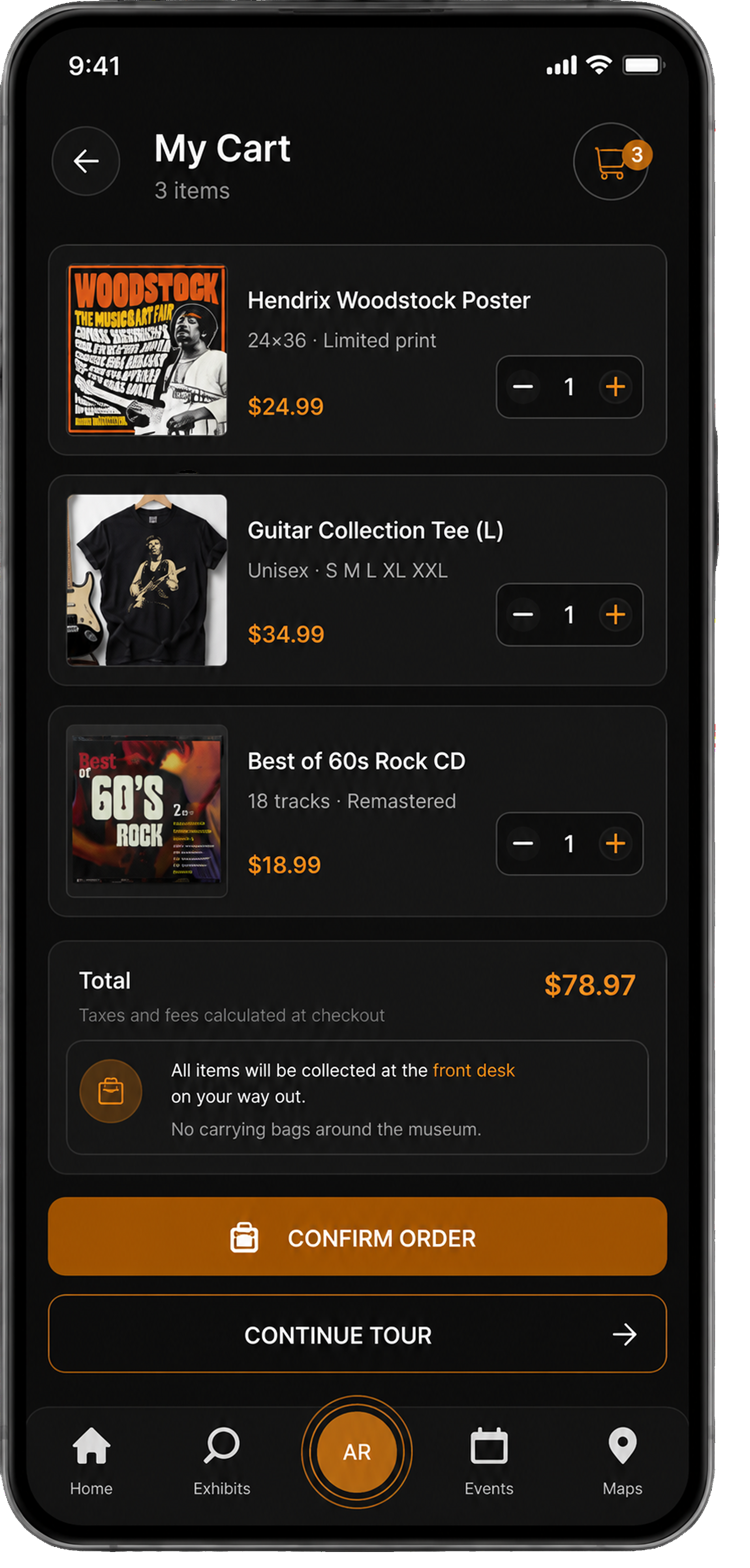
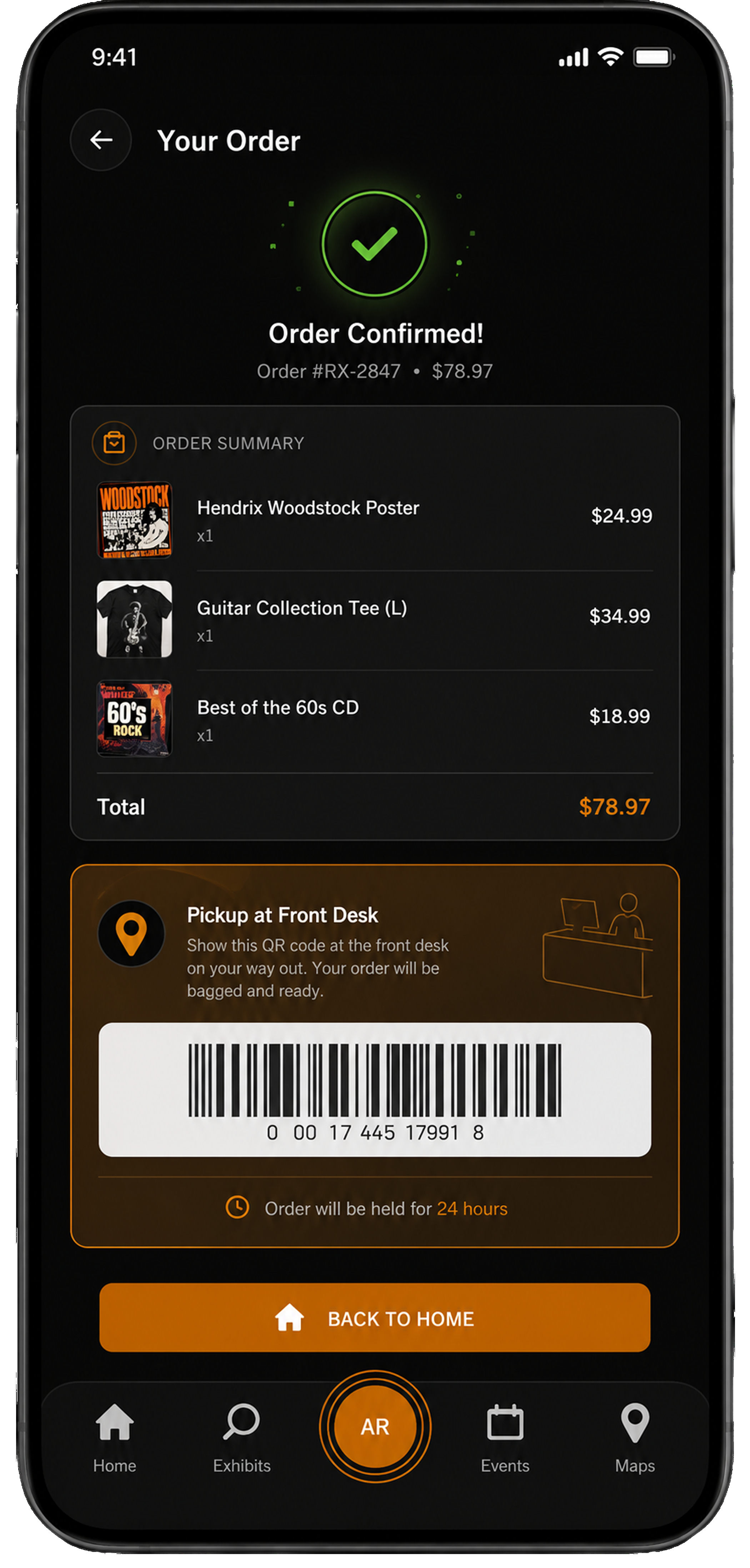
One dark, music-first visual language: high contrast for dim galleries, warm amber accents pulled straight from stage lighting, carried from the first scan to entry and tickets.
Design system.
RockX runs on Roboto and a dark, stage-lit palette. One type scale and a focused set of colours keep the atmosphere consistent from the first scan to the last exhibit.
Typography.
Colours.
Components.
A shared library of the pieces that repeat across the app, each with a rule for when to use it, so every screen is assembled the same way.
One amber primary per screen for the main action; an outline secondary beside it; disabled greys out and loses the fill.
Filled amber chips for selectable filters (music, era); a text-amber tag flags AR-enabled exhibits.
The workhorse list row for tour stops and exhibits: thumbnail, title, meta, and a chevron to drill in.
Dark fields with an amber focus ring; toggles fill amber when on. Used for search and per-feature settings.
A single-weight amber line-icon set for the tab bar and actions; 2px strokes, rounded caps.
Segmented control for switching views (upcoming vs past events, merch categories); the active tab fills amber.
Shows how far through the Quick Plan Builder a visitor is, so the short setup feels finishable.
Radios for single choices (where to stream); checkboxes for multi-select music and era in the quiz.
Adjusts ticket and merch quantities in the cart; amber controls on a dark field.
For constrained choices like hall or genre; expands to a scrollable list on tap.
Built to scale.
Built from patterns
I pulled the pieces that kept repeating in the flows into tokens and components, so the system grew out of real screens rather than theory.
Shared across surfaces
The same library and tokens fed the consumer website, the visitor app, and the admin tool, keeping three designers aligned without re-deciding the basics.
Faster, consistent
New screens were assembled from existing components, which cut rework and kept the dark, stage-lit look identical from the first scan to the last exhibit.
What it shows.
RockX was about designing an experience, not just an interface: atmosphere, orientation, and the feeling of being guided. It pushed me on mood and craft (a confident dark theme) and on grounding a flashy idea like AR in the boring, essential question: what does the visitor actually need to do next?